| Image |
Comment |
| 11/18/2004 08:31:58 PM |
belt it out baby!by shutterflyComment: Nice framing. I see the cat's mouth as your focal point so I would like it to be very clear and crisp. |
 Photographer found comment helpful. Photographer found comment helpful. |
| 11/18/2004 08:30:53 PM |
Peeled Faithby BethanComment: Great idea for texture and title. I would like to see more aged wood and less peeling paint for more of a value range. The angle and cropping seem sort of midrange. I would like to see you pull out further or in tighter. |
| Photographer found comment helpful. |
| 11/18/2004 08:29:00 PM |
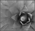
Delicate unfoldingsby supradaComment: Interesting framing and pattern. I am unsure if the flecks on the leaves are water. I would like to be able to tell. |
| Photographer found comment helpful. |
| 11/18/2004 08:27:52 PM |
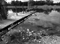
Reflectionsby GallatinComment: Stunning use of light and shadow, striking framing and angle. Beautiful picture! |
| Photographer found comment helpful. |
| 11/18/2004 08:26:55 PM |
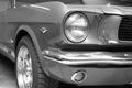
Old stallionby andrimComment: I like the angle and the cropping. I would like to see the entire car look as clean and sharp as the hubcap and tire. I like the line and shine of a car in a black and white photo. I also like your choice of model. |
| Photographer found comment helpful. |
| 11/18/2004 08:24:28 PM |
|
| Photographer found comment helpful. |
| 11/18/2004 06:14:30 AM |
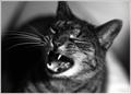
Leeby JSchoComment: I like the intensity of this photo. The subject's expression is defiantly insecure. I don't like how much black space fills the right side of the image; it distracts from the amazing intensity you have captured in the subject's face. |
| Photographer found comment helpful. |
| 11/18/2004 06:11:37 AM |
The Tree Stands Aloneby aerogurlComment: The scale is interesting in this photo, but I don't see anything dramatic enough to really capture my attention. |
| Photographer found comment helpful. |
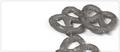
| 11/17/2004 06:41:21 PM |
Midnight Snackby StevePaxComment: Fun idea, but the values are too limited and huge while space just doesn't work well for me. The cropping of the bottom pretzel is too symetrical; cutting image right in the midline makes it seem contrived rather than random. |
| Photographer found comment helpful. |
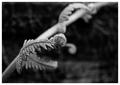
| 11/17/2004 06:39:20 PM |
Convolutedby sherComment: How can you go wrong with unfurling fronds? Crop it closer and let it take over the picture. Nice detail in the foreground. The background is too much and too soft to complement your focal point, which is stunning by the way. |
| Photographer found comment helpful. |
Home -
Challenges -
Community -
League -
Photos -
Cameras -
Lenses -
Learn -
Help -
Terms of Use -
Privacy -
Top ^
DPChallenge, and website content and design, Copyright © 2001-2025 Challenging Technologies, LLC.
All digital photo copyrights belong to the photographers and may not be used without permission.
Current Server Time: 04/07/2025 10:08:56 PM EDT.