| Image |
Comment |
| 06/18/2003 02:22:33 PM |
Self -Portraitby chelseayankieComment: Nice framing, but I'm not crazy about the knee - it's kinda coming out of nowhere and looks a little strange. Would have liked to see this in color for the eyes. |
 Photographer found comment helpful. Photographer found comment helpful. |
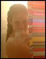
| 06/18/2003 10:15:21 AM |
Steamed Upby RiderGalComment: I think i have the same shower curtain. that backlight is a killer - washes out all the colors. |
| Photographer found comment helpful. |
| 06/18/2003 10:13:49 AM |
My - Self - Portraitby frozensunComment: The framing could be a little better - no offense, but the way it is is a little boring. Nice scenery though. sunglasses not really necessary. |
| Photographer found comment helpful. |
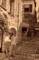
| 06/18/2003 10:05:22 AM |
Back to the old daysby ewebComment: whoa, easy on the sepia. i'm a little overwhelmed by that. that stairway is nice, should have used a bit more of it. also, you should have done something to stand out from the background. nat light, a flash, something |
| Photographer found comment helpful. |
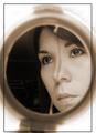
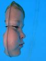
| 06/18/2003 09:59:08 AM |
Half of Me is Blue...by pinbackComment: I think the crop could be better here. I guess you were going for the neg space thing, but based on your face in the frame, I don't think it works too well. Might want to crop out all the black on the right then crop so your nose is centered - more of a portrait orientation rather than a square. |
| Photographer found comment helpful. |
| 06/18/2003 09:54:42 AM |
|
| Photographer found comment helpful. |
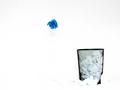
| 09/20/2002 04:23:00 PM |
Blew itby FrooberComment: I like this shot, but I think it would look better if the top of the background was pure white to match the rest of the shot. |
| Photographer found comment helpful. |
| 09/22/2002 07:48:00 PM |
|
| Photographer found comment helpful. |
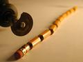
| 08/23/2002 01:59:00 PM |
The Pencil That Wasby fas-ligandComment: Nice shot. A little more curve in the cut up pencil might be nice. I'd also like to see just a bit more DOF so the eraser was in focus. |
| Photographer found comment helpful. |
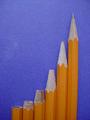
| 08/19/2002 09:43:00 AM |
Evolutionby MarkRobComment: Nice idea, but I think you could have done some things better. A little more light on the pencils would help them stand out more. Also, you might want to set them up a few feet in front of the background to give some depth. The tip of the pencils at the far right and far left are out of focus. This could use a little counter-clockwise rotation and you should save at the best quality that gives you a file less than 150k. There are some jpeg artifacts. |
| Photographer found comment helpful. |
Home -
Challenges -
Community -
League -
Photos -
Cameras -
Lenses -
Learn -
Help -
Terms of Use -
Privacy -
Top ^
DPChallenge, and website content and design, Copyright © 2001-2025 Challenging Technologies, LLC.
All digital photo copyrights belong to the photographers and may not be used without permission.
Current Server Time: 04/09/2025 01:23:42 PM EDT.