| Image |
Comment |
| 05/06/2004 11:01:10 PM |
|
 Photographer found comment helpful. Photographer found comment helpful. |
| 05/06/2004 11:00:29 PM |
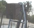
High Security by jjbeguinComment: Very nice, one of my favourites in this challenge. I like the straight lines created by the wood and the diagonal created by the chains. |
| Photographer found comment helpful. |
| 05/06/2004 10:56:40 PM |
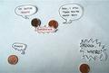
Fondue Anyone?by mirdonamyComment: Yuk! Puts me off marshmallows :P
The blue background is nice. I find it a little hard to focus on the forks because the front one is out of focus. |
| Photographer found comment helpful. |
| 05/06/2004 10:54:57 PM |
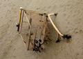
Rusted Earthby sixmacsComment: I'm not sure what this is, but the curve is nice. I think it would be more successful if it was brighter with a white background. |
| Photographer found comment helpful. |
| 05/06/2004 03:12:18 AM |
|
| Photographer found comment helpful. |
| 05/06/2004 02:10:55 AM |
what's behind?by exbeComment: It would benefit the image if the blurry part wasn't dead centre. It's hard to focus on the image because your eye doesn't know where to go. |
| Photographer found comment helpful. |
| 05/06/2004 02:03:04 AM |
Rusty Hands of Timeby KylieComment: I find the words distracting from the overall image. Perhaps focussing in on the clock hands would make a difference? |
| Photographer found comment helpful. |
| 05/05/2004 11:38:32 PM |
Oilby TrueGeekComment: The angle is a little disturbing. There could be more interest added by not centering the main item. The colours are quite dull - levels should be adjusted in Photoshop to bring out the colours. |
| Photographer found comment helpful. |
| 05/05/2004 12:54:30 AM |
|
| Photographer found comment helpful. |
| 05/05/2004 12:48:51 AM |
Lost Soulby redmoonComment: It's a good idea, but it doesn't hold a lot of interest. Try not centreing the trolley and see how it goes. |
| Photographer found comment helpful. |
Home -
Challenges -
Community -
League -
Photos -
Cameras -
Lenses -
Learn -
Help -
Terms of Use -
Privacy -
Top ^
DPChallenge, and website content and design, Copyright © 2001-2025 Challenging Technologies, LLC.
All digital photo copyrights belong to the photographers and may not be used without permission.
Current Server Time: 04/07/2025 10:02:30 PM EDT.