| Image |
Comment |
| 07/16/2006 12:31:25 PM |
|
 Photographer found comment helpful. Photographer found comment helpful. |
| 07/16/2006 12:30:32 PM |
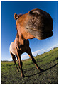
From The Horse's Mouth by PedroComment: Very funny shot! Nice to see that all is not serious an boring here at dpc :)
Good use of the fisheye. |
| Photographer found comment helpful. |
| 07/16/2006 12:25:54 PM |
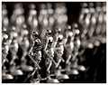
Flotillaby Keith ManiacComment: Excellent colours and composition. Nice S-shaped line used to perfection. |
| Photographer found comment helpful. |
| 07/16/2006 12:24:32 PM |
|
| Photographer found comment helpful. |
| 07/16/2006 12:20:40 PM |
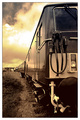
Spirit of Blaenavonby ArtanComment: I like this very much, the perspective, the muted colours and the lines.
Only negative would be the slightly too bright sky. |
| Photographer found comment helpful. |
| 07/12/2006 02:17:20 PM |
Sky Diversby raishComment: 4 kvartaler unnå mitt motiv ;) Tror nok du skårer høyere, tror jeg fikk en 6'er sist jeg prøvde meg på disse kara her, men ditt er bedre. Lykke til. |
| Photographer found comment helpful. |
| 06/23/2006 02:32:28 PM |
Pensiveby lizzyc3Comment: The soft look is not enhanced by the oof background. The upper too bright area is distracting, both hair and background. NOt sure that you needed the animal, the girl is very pretty as it is, no need to cute it up. All in all it gets an average score. |
| Photographer found comment helpful. |
| 06/23/2006 02:28:59 PM |
On the Window-paneby mannjuditComment: This is just bad. From the grainyness to the purple fringes and completely meaningless subject. The oof areas look pretty ugly and does not enhance the picture in any way. A very bad entry. |
| Photographer found comment helpful. |
| 06/23/2006 02:27:26 PM |
Home Runby BradComment: This entry has very over-processed look. The oof areas look pretty harsh and grainy and does not enhance the picture in any way. A very average entry. |
| Photographer found comment helpful. |
| 06/23/2006 02:26:47 PM |
tweeby MarkComment: The composition is not bad, could perhaps have tried for a more contrasting background. Very nice bokeh which make this a pleasing, sligthly above average shot. |
| Photographer found comment helpful. |
Home -
Challenges -
Community -
League -
Photos -
Cameras -
Lenses -
Learn -
Help -
Terms of Use -
Privacy -
Top ^
DPChallenge, and website content and design, Copyright © 2001-2025 Challenging Technologies, LLC.
All digital photo copyrights belong to the photographers and may not be used without permission.
Current Server Time: 04/07/2025 10:15:10 PM EDT.