| Image |
Comment |
| 04/29/2004 09:27:11 PM |
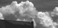
Antennaby GeneralEComment: Greetings from the critique club
Composition: The subject of this photo seems to be the antenna on the rooftop. Its position within the photo gives it a position of focus, since the foreground is dark and the background is so light. It sits at the edge of the roofline like the mast of a ship. The framing of the antenna could be closer for the purposes of the challenge to highlight the negative nature of the wire against the light background.
Background: The background of the spectacularly tumbling clouds really makes the photo work. The sky beyond that is lost in the black and white choice.
Camera Work: (Focus/DOF/Exposure) - the graininess is distracting, as I think the clouds woudl really pop with a crisp photo.
Post Processing: The grainy treatment and the black and white are subjective choices. The antenna and challenge subject of silhouettes I think benefit from the decoloring.
My Opinion: As a pure work of photographic art, I think the shot could benefit from color. I'm a sucker for cloudscapes and majestic skies. I might like to see it recropped in color to highlight the feeling of the ship at sea corner of the building part.
If you found my comments helpful, please let me know. If you have any other comments, please feel free to PM me. texttext |
 Photographer found comment helpful. Photographer found comment helpful. |
| 04/29/2004 11:55:33 AM |
dancing at duskby tomzinhoComment: Greetings from the Critique Club!
An interesting an evocative shot. I like the backlighting coupled with the faint visibility of the green of the leaves and the blue of the sky.
I agree with the other commenters that the composition could use some help. I think you made the right decision with placing the densest part of the tree in the top of the shot. I think I'd like to see the shot framed in a way that places the light source (sun) a bit more to the left and even up a little more or perhaps in the top third (I know you'd lose a little of the crown).
The tree has a wonderfully upright quality that gets diluted when those few more diagonal crossing branches are too close to the center of the frame.
I think the main question for you to ask yourself is what the main subject of the photo is to be and direct the viewers eye to what you want them to see - are you highlighting the branches, the leaves or the overall lines of the tree. I'd be interested to see if recropping this photo with that in mind might not yield a more pleasing composition.
Focus - good, could be crisper but I would not object to an artistic choice of a little softer either.
Depth of Field - good
Color/Contrast - good, I like the saturation of the the leaves and sky with the desaturation of the limbs and branches |
| Photographer found comment helpful. |
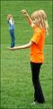
| 04/29/2004 10:59:00 AM |
It's my turn to torture you BIG sister!by NeuferlandComment: I like this photo very much and feel it fits the challenge. It's well composed to get the desired effect and has a bit of humor to it. I like the foreground girl's shirt color and the vibrant color of the grass in contrast to the figures. I wish the background girl didn't have her hands so close to her face and I could see her a little better. |
| Photographer found comment helpful. |
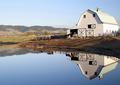
| 04/28/2004 04:31:54 PM |
Reflection Twoby michaelkComment: I love the symmetry of the reflection and clarity of the photo. I wish it was slightly bigger so I could really take it all in. THe composition is very nice as is the saturation and contrast. |
| Photographer found comment helpful. |
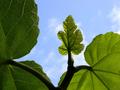
| 04/28/2004 01:50:36 PM |
Adam and Eve's Closetby autoolComment: Beautiful colors, wonderfully sharp. I like the detail and the scale of the young leaf compared to the mature ones. |
| Photographer found comment helpful. |
| 04/28/2004 01:49:04 PM |
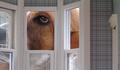
Ollie in Wonderland by rileyComment: I really like this shot, it's whimsical and a great interpretation of the challange. I'd love to see the dog's eye just a little bit lower so we can see his brow a bit, and maybe a bit more contrast inside the dollhouse and maybe more context with the doll furniture or other furnishings. |
| Photographer found comment helpful. |
| 04/28/2004 01:38:50 PM |
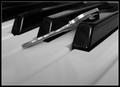
Not all keys are created equal.by nikon_girlComment: I like the simplicity and composition of this shot. The black and white works well with the achromatic nature of the subject. I might like to see more of the face of the key, so that it's more obvious what the object is. But l like the forced perspective and matte nature of the keys with the grainines of the film. |
| Photographer found comment helpful. |
| 04/28/2004 11:59:39 AM |
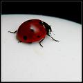
Curvature of an Eggby leafComment: I like this very much. I like the repetition of the curvature of the beetle and the eggshell. The photo could be a little sharper but I like the contrast of colors. I'm curious to know if a wider shot with more of the egg showing would be more successful compositionally. |
| Photographer found comment helpful. |
| 04/28/2004 11:56:12 AM |
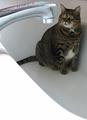
Big cat in a small bathby menardmamComment: I like the forced perspective on this and the cat's expression as well. The white in the foreground make dominate a little too much but otherwise a delightful well composed photo. |
| Photographer found comment helpful. |
| 04/27/2004 04:35:17 PM |
Down By the Stationby MJENNIComment: I love this! A beautiful shot - the light is perfect, as are the clouds and placement of the sign and tracks going off in the distance. Nice composition. |
| Photographer found comment helpful. |
Home -
Challenges -
Community -
League -
Photos -
Cameras -
Lenses -
Learn -
Help -
Terms of Use -
Privacy -
Top ^
DPChallenge, and website content and design, Copyright © 2001-2025 Challenging Technologies, LLC.
All digital photo copyrights belong to the photographers and may not be used without permission.
Current Server Time: 04/07/2025 10:11:53 PM EDT.