| Image |
Comment |
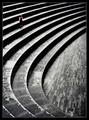
| 04/28/2005 03:39:34 PM |
too manyby ericsuthComment: Greetings from the Critique Club
I love the density and depth of field of this shot.
The monocrhome choice is very appropriate for your subject and style. It feels like a stock photo shot (that's a compliment).
Your use of the mirror for the shot is also very well executed.
The choice of a portrait framing is interesting, I wonder what square or landscape would do for the level of interest in your composition? |
 Photographer found comment helpful. Photographer found comment helpful. |
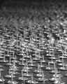
| 04/28/2005 03:34:48 PM |
$3.97 + Tactsby banmornComment: Greetings from the Critique Club!
This is a fun shot for the challenge. I like the combination of both thumbtacks and pushpins. (Or whatever you call the different styles.)
The colors are vibrant and true and the shiny quality of the steel tacks adds some dimension to what might be monotonous. There is a slight color cast of green to the shot on my monitor (another commenter noted this, too) that makes it feel like office lighting was used - though that doesn't really bother me since that is one of their habitats.
I like that you chose to leave some foreground instead of a consistent field of tacks. |
| Photographer found comment helpful. |
| 04/28/2005 02:18:49 PM |
minimalism ruinsby anatolio25Comment: I think the subject is great and the composition is good. However, it looks like it has been oversharpened and the graininess it created is not compelling. |
| Photographer found comment helpful. |
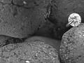
| 04/28/2005 01:48:36 PM |
Bad Aphidsby GringoComment: Nice take. Well placed. Interesting color replacement. |
| Photographer found comment helpful. |
| 04/28/2005 01:16:25 PM |
Springing Upby ruffianComment: The colors are nice, but the blades of grass aren't crisp enough. Perhaps a shallower depth of field and better focus on the grass would yield a more interesting composition. |
| Photographer found comment helpful. |
| 04/28/2005 01:14:36 PM |
|
| Photographer found comment helpful. |
| 04/28/2005 01:13:39 PM |
Buttonby ckdakeComment: While the composition is interesting, the focus is too soft. |
| Photographer found comment helpful. |
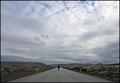
| 04/28/2005 01:12:32 PM |
Reaching Nowhereby arnitComment: Great composition, I love the vastness of it all and the simplicity with the balanced, center of the road. 8 |
| Photographer found comment helpful. |
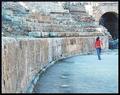
| 04/28/2005 11:33:01 AM |
Repetition with variations for small childby e301Comment: Very nicely shot - I love the abstractness contrasted with the reality of the child. The rotation of the photo wiht the pattern of the floor being parallel to the left edge gives the photo a little feeling of imbalance - did you try it slightly rotated clockwise? 7 |
| Photographer found comment helpful. |
| 04/28/2005 11:30:12 AM |
The Sunby mimidComment: Nicely captured - the repetition of the pattern gives a cohesiveness to this that still fits within the minimalist feel. 7 |
| Photographer found comment helpful. |
Home -
Challenges -
Community -
League -
Photos -
Cameras -
Lenses -
Learn -
Help -
Terms of Use -
Privacy -
Top ^
DPChallenge, and website content and design, Copyright © 2001-2025 Challenging Technologies, LLC.
All digital photo copyrights belong to the photographers and may not be used without permission.
Current Server Time: 04/07/2025 10:18:19 PM EDT.