| Image |
Comment |
| 06/22/2011 04:58:33 AM |
|
 Photographer found comment helpful. Photographer found comment helpful. |
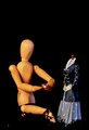
| 06/21/2011 09:52:01 PM |
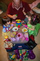
Rapture Bombby pixelpigComment: I'm sooo sorry to see this didn't rank higher. I love the idea! I am, however, a bit distracted by all the bits on the desk- wondering if a cleaner surrounding would have made the idea stronger/ easier for the viewer to absorb? |
| Photographer found comment helpful. |
| 06/21/2011 09:47:59 PM |
|
| Photographer found comment helpful. |
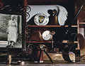
| 06/21/2011 09:46:51 PM |
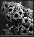
Gramby KelliComment: I started to comment during voting and since no one else has...
The first thing I notice is that the flowers are artificial. Also, I'm wondering if a brighter light source would have provided you with more contrast seeing as you choose to use blk/wht? Perhaps would have given you more depth. As a viewer- I'm wanting to know the meaning of the tin objects in the lower left- but I can't quite make them out. I do love the title! That's what I called my Gram...
|
| Photographer found comment helpful. |
| 06/21/2011 07:19:38 PM |
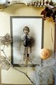
the little kafkaby tnunComment: I like the way you used the subject simultaneously as the frame. Nice prop placement. |
| Photographer found comment helpful. |
| 06/18/2011 09:00:12 PM |
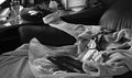
I know I am poor and you have a certain social status, but..LOVE IS BLINDby GroggyComment: I will be the first to admit that I'm exhausted with seeing the wooden form on this site... I will try to set my prejudice aside. The layout here leaves the entire top half of the photo just... black. Bringing in the crop focus my attention better. The black confetti also feels... awkward? The subjects feel random- completely different proportions. I have challenges absorbing the overall idea of this pieces |
| Photographer found comment helpful. |
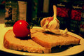
| 06/18/2011 08:52:44 PM |
bruschettaby danieletagliabueComment: I love the idea here. I would imagine a loaf of unsliced french bread would have completed the concept of bruschetta 'undone' if you will. I dig the tone you chose as well. Perhaps a slightly cleaner background would have lit your subject shine more? I also like the choice of brash lighting here- the shadows are working for me. |
| Photographer found comment helpful. |
| 06/18/2011 08:48:33 PM |
what a web site by surfer57Comment: Obviously a beautiful shot. It almost looks like a jewelery ad. But the subject matter is not what comes to mind when I think of a 'still life' shot. |
| Photographer found comment helpful. |
| 06/18/2011 08:41:04 PM |
Aunt Minnieby aprudhommeComment: This is easy to look at. Has a 'time capsule' feel to it & I like the colour choice here. However, it sort of feels like an image I would see mass produced and hovering over my table at a Chili's- Which is not necessarily a bad thing ;) I do appreciate the decision to have such distinctive shadows- I can almost feel the parallel of time passing over Aunt Minnie's life as the setting sun casts a shadow on her things... well done. |
| Photographer found comment helpful. |
| 06/18/2011 08:35:12 PM |
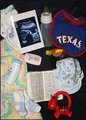
It's Still Life...Even Before Birth.by wifeofmatthewComment: This image feels a little hot to my eye. The contrast of the white of the objects is super stark compared to the black background. Perhaps a softer background tone would be easier for my eye to absorb. The primary shades of red and blue feel out of place with the pastel pallet. I will ignore the polarizing political statement in order to give you a score solely based on the image...you're welcome ;) |
| Photographer found comment helpful. |
Home -
Challenges -
Community -
League -
Photos -
Cameras -
Lenses -
Learn -
Help -
Terms of Use -
Privacy -
Top ^
DPChallenge, and website content and design, Copyright © 2001-2025 Challenging Technologies, LLC.
All digital photo copyrights belong to the photographers and may not be used without permission.
Current Server Time: 04/07/2025 10:18:11 PM EDT.