| Image |
Comment |
| 01/26/2007 05:40:31 AM |
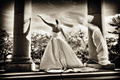
Christina by grigrigirlComment: It's good to see you back again -- and in such good form! Congrats. |
 Photographer found comment helpful. Photographer found comment helpful. |
| 12/17/2006 07:30:21 PM |
|
| Photographer found comment helpful. |
| 12/17/2006 07:28:50 PM |
|
| Photographer found comment helpful. |
| 10/04/2006 03:06:26 AM |
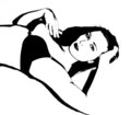
Seductive Contrastby Blue MoonComment: I would be interested in hearing how you did this. Your left forarm is what I end up with when uping the contrast to extremes like this -- loss of pieces of the image.
With just he one side of the one arm, it's just part of the what helps keep the image balanced. With the side of the arm there the whole image would seem unbalanced. But as it is, the blend with the background creates the impression of added weight to offset your torso.
The lack of detail, and yet retaining the recognizability of your face is the part I like the best. Well done.
Since you asked specifically how it would have done if entered -- I don't think it would have done well. I'm often wrong in how I think things will place, but I have a feeling there will be far too many voting down for it not 'looking' like a photograph anymore.
David |
| Photographer found comment helpful. |
| 10/04/2006 02:45:07 AM |
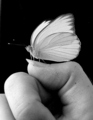
Textures in Black and Whiteby Blue MoonComment: I love the tones and textures of this (except for the grid). I have to disagree with a lot of your commenters though -- I don't think the image would work near as well without the sand.
The eye is pulled to strong contrasts, first to the bright area of the wings against the deep black of the background, but then following the lines and textures of the wings and legs down to your thumb. Here my eye is pulled toward the dark area between light thumb and fingers -- but is kept from going in by the barrier line of sand that gently lifts my eyes back up to the butterfly. Intentional or not, the sand works for me.
David |
| Photographer found comment helpful. |
| 10/04/2006 02:36:09 AM |
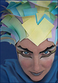
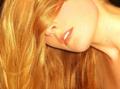
I 'm Naturally 'Gold'by Blue MoonComment: For the record -- No, you do not need to cut it. There, got that off my chest. :D
I realize you were shooting for a close-up to show focus on the texture and color, but I have to agree with your original idea. The first thing I thought of when I saw the picture was 'Beautiful hair', but then I was following the line of the strands down out of the frame. Like I said, I agree with your original idea; including all of your hair in the shot would have been great.
David |
| Photographer found comment helpful. |
| 09/08/2006 03:09:08 AM |
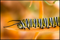
Stripesby spydrComment: I love the colors on this -- most of all the distinction between the leaf and the similarly colored background -- absolutely great.
I would however offer the timid advice of a more dynamic angle for the main subject -- the horizontally flat composition saps a great deal of energy from this vibrant image.
David |
| Photographer found comment helpful. |
| 07/31/2006 02:16:08 AM |
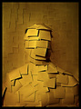
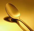
Goldenwareby myceliumComment: Superb tribute and wonderfully executed study!
Closely matches one of my favorite images by e301 as well as the one that inspired you.
The gradient from gold to brown was an inspired method of ensuring any monitor would show gold somewhere on their screen.
David |
| Photographer found comment helpful. |
| 07/09/2006 01:44:02 AM |
|
| Photographer found comment helpful. |
| 07/09/2006 01:42:48 AM |
|
| Photographer found comment helpful. |
Home -
Challenges -
Community -
League -
Photos -
Cameras -
Lenses -
Learn -
Help -
Terms of Use -
Privacy -
Top ^
DPChallenge, and website content and design, Copyright © 2001-2025 Challenging Technologies, LLC.
All digital photo copyrights belong to the photographers and may not be used without permission.
Current Server Time: 04/07/2025 09:05:49 AM EDT.