| Image |
Comment |
| 08/23/2004 05:27:20 PM |
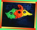
Finding neon where I can...by ursulasComment: The border sucks. This would be WAY better without it.
I'll pretend like I don't see the crappy, 80's border, and the pic is technically excellent. From left to right, looks like a fish, a bunny, and a duck. Am i right? Love the blue in the jeans, too... 8 |
 Photographer found comment helpful. Photographer found comment helpful. |
| 08/23/2004 05:24:48 PM |
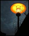
Neon Glowby DianaBComment: kinda... cool. Pictures have a lot more punch (usually), when the viewer has some clue of what he/she is looking at. But nice effort. 7 |
| Photographer found comment helpful. |
| 08/23/2004 05:23:48 PM |
Separeted Worldsby MonaComment: after looking at the other submissions, this is a sight for sore eyes. Thanks for the awesome idea, thanks for the good title, thanks for not taking a picture of a neon sign, thanks for the effort. I'm giving you a 10 because everyone else sucks (and your picture is also quite good). |
| Photographer found comment helpful. |
| 08/23/2004 05:20:50 PM |
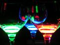
Drinksby diegomcnamaraComment: Papa like.
Very nice, Will be in the top 25% i think. maybe a bit higher! 8 |
| Photographer found comment helpful. |
| 08/23/2004 05:17:59 PM |
20 cents neonby PhileineComment: Cut back on the noise, focus a little better and bump the saturation (maybe not depending on how good the first two things would make it look) and this would be a lot stronger. 5 - for not taking a picture of a neon sign (thank you for that). |
| Photographer found comment helpful. |
| 08/23/2004 05:16:51 PM |
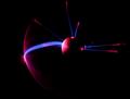
Energyby DougPazComment: Gorgeous. Top ten? Maybe top 3...
looks like an eclipse in a way. 10 |
| Photographer found comment helpful. |
| 08/23/2004 05:16:07 PM |
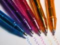
Neon Pensby GinaRothfelsComment: Nice, missing a certain umph to bring it from "nice" to "advertisement..." Maybe some more apparent DOF or something, and a more creative placement of the pens... |
| Photographer found comment helpful. |
| 08/23/2004 05:15:04 PM |
|
| Photographer found comment helpful. |
| 08/23/2004 05:13:40 PM |
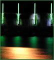
Neon Glowby gerdagriceComment: Would be nicer with more crisp edges and no glare. Would also be better if the person was a complete sillhouette. Nice idea though! 7 |
| Photographer found comment helpful. |
| 08/23/2004 05:09:58 PM |
|
| Photographer found comment helpful. |
Home -
Challenges -
Community -
League -
Photos -
Cameras -
Lenses -
Learn -
Help -
Terms of Use -
Privacy -
Top ^
DPChallenge, and website content and design, Copyright © 2001-2025 Challenging Technologies, LLC.
All digital photo copyrights belong to the photographers and may not be used without permission.
Current Server Time: 04/07/2025 10:03:26 PM EDT.