|
|
|
Showing 101 - 110 of ~361 |
| Image |
Comment |
| 01/19/2006 06:18:22 PM | |  Photographer found comment helpful. Photographer found comment helpful. |
| 01/19/2006 06:08:54 PM | | | Photographer found comment helpful. |
| 01/13/2006 11:38:53 AM | Rush Hour .by WessyComment: This is incredible. I wonder what it looks like in black and white... | | Photographer found comment helpful. |
| 11/13/2005 10:43:10 AM | | | Photographer found comment helpful. |
| 11/03/2005 11:21:27 AM | Contaigous Smileby idnicComment: Idnic,
Personally, this is one of my favorite photographs of yours, and while I think perhaps the grain could have been toned down a bit, I think this is also one of the rare occasions where I'm glad you didn't try to use the rule of thirds. Centered composition works very well here. There is a perfect balance of darks and lights, (I love this kid's hair!!) and I think part of the beauty here is that the grain does not detract whatsoever from the softness and detail from the subject.
Thanks for taking this. I'm glad I got to critique it. :)
-- Critique Club | | Photographer found comment helpful. |
| 11/03/2005 11:17:13 AM | Danielby RgarciaComment: Roberto,
I LOVE this portrait: the feeling, the creative positioning, everything, and I think it is underrated.
However, I think one thihg that could have helped this is if you had desaturated this AFTER adding noise, thus getting rid of the colored noise. Some find it appealing, but my guess is (and judging by the score) most people would rather have it all color or all black & white, and this is sort of both.
The only other possibility for improvement (in my opinion) is if you had left some of the shoulder in the frame. The composition, though not completely centered, does still feel somewhat centered.
Great job though, this is a very attractive shot.
-- Critique Club | | Photographer found comment helpful. |
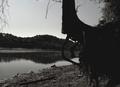
| 11/03/2005 11:05:30 AM | Moonlight Serenadeby rayg544Comment: Ray,
I've seen your other shots, and they are excellent, so what I'm going to say about this one probably won't be anything you don't already know, but here are a few things I thought while looking at this.
1. I like the reflection a lot. I love reflections in general, but what is the focus here? Is it the reflection or the monstrosity in the foreground?
2. On the other hand, the monstrosity in the foreground is probably an amazing sight to see, with all the intricate roots and branches, etc., but it's completely black.
I'm not even really saying this has to be in better focus. Sometimes photographs don't need that. I do, however, feel that the tree should be brighter so that we can see detail. As it stands, I'm left confused as to what the main focal point is in this picture. I like the feel of it because it reminds me of things and places, but it's lacking that central focus that would hit home for most people.
You're a great photographer though, so keep up the good work. :)
-- Critique Club | | Photographer found comment helpful. |
| 11/03/2005 10:59:30 AM | Runinng Down the Middleby moviemanComment: David,
Nice black & white! I think in this case, black & white was a good choice with the high contrast. Those two elements bring out the motion going on in this photograph.
Having said that, there are some obvious areas for improvement that I can see, one of which is that the contrast is so high, almost all of the whites are completely blown out, draining detail from even the runner in who is in focus, and while I think you've done a sufficient job of drawing the eye to the guy with the ball, there is quite a bit going on. Generally, sports shots contain fewer players so that there is no confusion as to what the focal point should be. I do like the composition, but it is a bit confusing.
Nice job, though. I think a little more detail would help the score.
-- Critique Club | | Photographer found comment helpful. |
| 11/01/2005 07:35:11 PM | ring aroundby ursulaComment: This is absolutely, insanely beautiful. This is magnificent work. Kudos for the creativity and originality.
Astonishing to me... | | Photographer found comment helpful. |
| 10/27/2005 09:33:52 PM | Pinkby pearlseyesComment: I like that your picture is "Light on White" and not just "White on White" like many others in this competition. 8
I despise the border, but the image is wonderful. | | Photographer found comment helpful. |
|
Showing 101 - 110 of ~361 |
Home -
Challenges -
Community -
League -
Photos -
Cameras -
Lenses -
Learn -
Help -
Terms of Use -
Privacy -
Top ^
DPChallenge, and website content and design, Copyright © 2001-2025 Challenging Technologies, LLC.
All digital photo copyrights belong to the photographers and may not be used without permission.
Current Server Time: 04/07/2025 10:18:37 PM EDT.
|