| Image |
Comment |
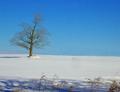
| 01/24/2004 02:45:29 AM |
Winter Solitudeby cardinalmomComment: I like this. I know the "photographic rules" etc say "forground interest" but if you crop the bottom of the picture to get rid of the foregound, that tree looks so lonely and isolated. It pulls it right out of the picture. Also if the camera had gone very slightly further to the left to get the complete shadow of the tree in it would have looked even more isolated. (I accept though that there may be something else there and it could not be done) |
 Photographer found comment helpful. Photographer found comment helpful. |
| 01/24/2004 02:40:05 AM |
|
| Photographer found comment helpful. |
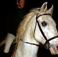
| 01/24/2004 02:37:52 AM |
Training for the Showby NeuferlandComment: These comments may not be appropriate because of camera used. If so, please accept my apologies. It may also be that the original is better than what appears on the monitor.
----
The flash seems to be straight on which in itself need not be a problem but it has burned out the front of the horses face. The coat and mane are beautifully exposed. Unfortunatly the dark coat of the rider has disembodied his head.
If an off camera flash had been used to the left and pointing up slightly and been held closer to the rider I think it may have illuminated at least the shape of the rider without leaving shadows on the horses face.
|
| Photographer found comment helpful. |
| 01/23/2004 04:35:03 AM |
Lord and Masterby ImagineerComment: I would be tempted to submit this to horse & hound, country life etc.
Wrong aspect for a cover but I think it could be used. The sky would allow text to be placed perfectly without destrying the subject |
| Photographer found comment helpful. |
| 01/23/2004 04:30:14 AM |
Emersion From Inversionby f-32Comment: Beautiful colours. Captured the snow beautifully and the treesin the lower left just look magical |
| Photographer found comment helpful. |
| 01/23/2004 04:21:51 AM |
Wood Bisonby C-FoxComment: I really like this but the head appears just that little bit too dark. I hope it is not just my monitor settings - (I am fairly confident it is not). Seems to be the only beast that has found something worth struggling to get at. Cropping to get rid of the right hand side almost to the tree stump would (I think) give it more impact |
| Photographer found comment helpful. |
| 01/23/2004 04:14:42 AM |
Wild And Flirty Cat Population In Europeby MonaComment: I do and I don't like this one. I know the eye is the main focal point but it seems just too bright. I manipulated it and toned down the eye and it seemed less intrusive but still kept the point. |
| Photographer found comment helpful. |
| 01/23/2004 04:12:13 AM |
Romanic Architecture of the 11th Centuryby Harz_JoergComment: Lovely muted colours, white whites and black blacks. The only thing that distracts me is the top left corner. It may look less intrusive if the left side was cropped out. It would mean losing a column but would balance the picture (I think) |
| Photographer found comment helpful. |
| 01/23/2004 04:06:34 AM |
Close-up Featherby vtruanComment: I see the idea and I like the patterns. Personall (and I know this is a very personal observation) it would have been nice to see a greater depth of field. |
| Photographer found comment helpful. |
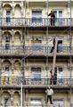
| 01/22/2004 09:59:58 AM |
Overhauling Historyby mbardeenComment: Didn't like this at first - except for it being so beautifully focussed and perfectly exposed - Then the humour of it got me - They look like the 3 (4) monkeys. Love it |
| Photographer found comment helpful. |
Home -
Challenges -
Community -
League -
Photos -
Cameras -
Lenses -
Learn -
Help -
Terms of Use -
Privacy -
Top ^
DPChallenge, and website content and design, Copyright © 2001-2025 Challenging Technologies, LLC.
All digital photo copyrights belong to the photographers and may not be used without permission.
Current Server Time: 04/07/2025 10:11:50 PM EDT.