| Image |
Comment |
| 03/29/2004 11:56:08 AM |
Neon Zoomby GordonComment: This is an astoundingly good image - the clarity is unlike anything i've really ever seen before - I want your camera! I so would like to know how you did this! The E in Joes is especially super! Technically it can't be faulted - and for sheer woomph factor it easily get's a 10. |
 Photographer found comment helpful. Photographer found comment helpful. |
| 03/29/2004 11:35:18 AM |
The Art of Blinkingby moviemanComment: Eurgh, creepy. This is a VERY original (and slightly disturbed) use for MB. I like the lighting and the colour of the wall (t-shirt, skin and wall all complimentary shades of brown) and albeit a little freaked out, recognise this as a great picture. 9. |
| Photographer found comment helpful. |
| 03/29/2004 06:43:01 AM |
Nude 1Aby dsrayComment: Too much MB - I can barely discern what's going on. As a piece of art on it's own merits, I think it's rather appealing - a big version on the wall in a restuarant would probably look really fab. But here, for the particular challenge, I think it's too messy. |
| Photographer found comment helpful. |
| 03/29/2004 06:29:28 AM |
Overwhelmedby jpochardComment: Stone me, can I relate to this! With regards of enhancing your image by use of MB, I must say this is one of the best examples I've seen. Technically, I thought that the image of the model is a bit noisy / pixelated - a gentle wash with NeatIamge type things would have helped a little bit. And a bit of gentle editting (with a clone brush perhaps) around the chair might have helped smooth the border between the fore and background. But it conveys your idea so brilliantly. So, slightly flawed but still genius; 9. |
| Photographer found comment helpful. |
| 03/29/2004 06:19:38 AM |
Whisperby AleciaComment: Sorry, but i'm not overtly keen on the motion of the fingers ; looks like the girl is being gently slapped on the nose. This would in fact be a FANTASTIC picture if the hand were not there at all, and if this was not a motion blur-type challenge. It's a truly lovely picture, but sadly is not enhanced by MB. The black and white style here is totally suitable, and it looks really good. Any other challenge minus fingers, 9. Unfortunately here I can only offer 7. |
| Photographer found comment helpful. |
| 03/29/2004 05:48:57 AM |
Takin' Another Hit in the Sponge Tossby kirbicComment: Cute, but really I thought that the image is too big and the sponge is too small - a bit more of an aggressive crop and more focus in the lads face and the sponge might have made what's going on more immediately apparent and more involving for the viewer. It's a nice idea, but I personally do not think that in this case the picture is enhanced by the motion blur. The clarity of colours and the focus is largely top notch though, and it is a likeable image. 5. |
| Photographer found comment helpful. |
| 03/29/2004 05:17:13 AM |
Special Deliveryby neilmwilsonComment: You don't know how much I envy this shot - I tried and tried but could not et such a good definition on a moving image. Techinically, I don't think I can fault this - I would add that personal taste finds a white van a little uninteresting, and it's a pity you have lost the extreme back end. But overall I am thoroughly impressed. 9. |
| Photographer found comment helpful. |
| 03/29/2004 05:01:10 AM |
Racing down the highwayby pcodyComment: This had a good potential (two cars together is different and difficult) but it just looks too blurry. If you used a shorter exposure or panned a little bit as the vehicles went passed (like the people who did the VW and Mercedes) the cars might have had a little more definition, and I think the impression of speed would be improved. I still think it is a fine effort - the bold colours work well and it still fits the challenge. 5. |
| Photographer found comment helpful. |
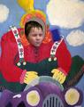
| 03/29/2004 04:00:32 AM |
Baseball in Flightby ColeyComment: hmm, either you are a very fast runner, or you are a bit of a dab hand with photoshop... It's reasonably convincing though i think it might be more so if you also applied a smidgeon of blur to the ball itself - it just looks like a too perfectly well-taken shot. Still the impression of motion blur is there, and I personallu think it's a well set-up shot. 8. |
| Photographer found comment helpful. |
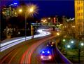
| 03/29/2004 02:59:03 AM |
Crash in the nightby terjeComment: I do like this image - though I'm not sure if the road incident adds or detracts from the overall shot. In my humblest opinion, the action to which the title refers isn't prominent enough in the overall crop to make a striking impact - I wonder if the shot might not work better a little closer to the police van, and cropped so it's without the admittedly nice, blue sky. The impression of speed from the lights is a good touch - the world going on around the vehicles works well. A bit of noise reduction might have helped, though (as would editting out the yellow slodges of glare). I think it fits the challenge pretty well, and I think i'd like to award a 6. |
| Photographer found comment helpful. |
Home -
Challenges -
Community -
League -
Photos -
Cameras -
Lenses -
Learn -
Help -
Terms of Use -
Privacy -
Top ^
DPChallenge, and website content and design, Copyright © 2001-2025 Challenging Technologies, LLC.
All digital photo copyrights belong to the photographers and may not be used without permission.
Current Server Time: 04/07/2025 10:05:30 PM EDT.