| Image |
Comment |
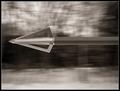
| 01/28/2004 07:24:46 PM |
Archer's Wrath by casualguyComment: Nice effect here, with the blurred background and completely sharp arrow. I'll guess at how you made it: Slow shutter speed, and moving a picture behind the arrow. However you did it, I like it. |
 Photographer found comment helpful. Photographer found comment helpful. |
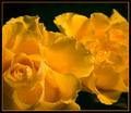
| 01/28/2004 07:22:46 PM |
Cancer - pointless metaphor n°3by jjbeguinComment: I like the colors here. They aren't really bright, there isn't a lot of contrast, but they do set a mood for the photo. I think it would help if the black background didn't have a texture, but was smooth. It also looks that the phone could be cleaned a little to make it look better. |
| Photographer found comment helpful. |
| 01/28/2004 05:03:32 PM |
|
| Photographer found comment helpful. |
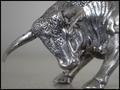
| 01/28/2004 05:01:51 PM |
Taurusby GinaRothfelsComment: I like the shot, and the perspective you took. You could probobly improve the composition a little, the bulls head seems to be in the middle of the frame. I like the way you blurred the background, really makes the subject stand out. You should have (maybe you did) tried the shot with a little softer light and a slower shutter speed, or bigger aperture so that the highlights weren't as bright. The right part of the picture seems out of focus, this was probobly intentional but it might have looked better if the bull was comepletely in focus. Overall very good shot. |
| Photographer found comment helpful. |
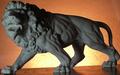
| 01/28/2004 04:55:05 PM |
Leo emergesby wkmenComment: Great shot. I like the lighting, you went with the lit from behind idea but kept a lot of the detail in the photo, didn't just settle for a siluet. To improve this I think a white, smooth background would have been better. That would make all of the shadows in the lion stand out. The wood table, and the grainy background don't help things in my opinion. |
| Photographer found comment helpful. |
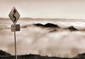
| 01/26/2004 03:23:50 PM |
Cloudy Corners by GringoComment: Very nice photo. I like what you did with the colors. Its just too bad the sign wasn't perfecttly vertical. I can see that the sign is whats tilted, not the camera since the horizon is tilted the other way. |
| Photographer found comment helpful. |
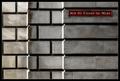
| 01/24/2004 10:41:54 AM |
Rue du Champ-de-Marsby mariomelComment: I like the pattern of the wall. The only thing is that the edges are blown out on the left side of each wall. |
| Photographer found comment helpful. |
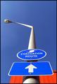
| 01/23/2004 02:39:47 PM |
Up A Poleby JeileenComment: I like this photo, but it would have been better without that orange in the background. If the day was a little cloudy it would have been more interesting. |
| Photographer found comment helpful. |
| 01/23/2004 02:37:25 PM |
|
| Photographer found comment helpful. |
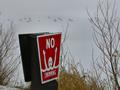
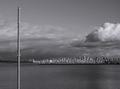
| 01/23/2004 02:34:16 PM |
Decoyby zeuszenComment: I like this photo, the black and white works well. Not sure if the pole adds anything to it, might be better without it. Good job overall. |
| Photographer found comment helpful. |
Home -
Challenges -
Community -
League -
Photos -
Cameras -
Lenses -
Learn -
Help -
Terms of Use -
Privacy -
Top ^
DPChallenge, and website content and design, Copyright © 2001-2025 Challenging Technologies, LLC.
All digital photo copyrights belong to the photographers and may not be used without permission.
Current Server Time: 04/07/2025 09:58:51 PM EDT.