| Image |
Comment |
| 02/15/2004 07:15:54 PM |
A Dance of Flamesby debgoffComment: I like the colors, the bright yellow, and orange of the fire really stands out from the background. On the other hand this is not very vreative, it seems you just pointed the camera at the fire, and pushed the button. Try to be more creative with this subject next time. |
 Photographer found comment helpful. Photographer found comment helpful. |
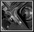
| 02/14/2004 06:44:02 PM |
Replaced by digital.by totiComment: I like that you used black and white here. The lighting could be better, I don't like how the inside of the lens hood is in such deep shadow. Putting a white, or black background behind the camera would make the photo better, the bcakground less distracting. |
| Photographer found comment helpful. |
| 02/12/2004 05:15:38 PM |
|
| Photographer found comment helpful. |
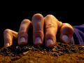
| 02/12/2004 05:14:35 PM |
The Edgeby SkiJumpNoseComment: I like the photo, the lighting could have been better, but I think it still works like this. I think that you should have placed your arm so that it wasn't in the shot. You should have also strained your hand so that it looked like you were trying to hold yourself from falling of the edge. But, overall I do like the photo, and think your take on the theme is interesting, and from what I've seen of other entries, original. |
| Photographer found comment helpful. |
| 02/11/2004 02:19:39 PM |
I'm Sure Gonna Miss That Old Carby drgsoellComment: I like this, very original. Better exposure, and lighting would make this photo much better. Even though nothing is blown out there are lots of places that are in very deep shadow. |
| Photographer found comment helpful. |
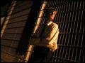
| 02/11/2004 02:18:19 PM |
You must let go, she´s goneby helgiComment: The photo doesn't meet the challenge, the title does. I do like this as a photo, even though it doesn't meet the challenge very well. The shadows might be a little too dark, but they do give the photo an interesting mood. |
| Photographer found comment helpful. |
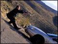
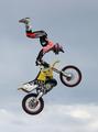
| 02/11/2004 02:16:11 PM |
Free your mind. by dinnComment: Great capture, must've used a very high shutter speed, can't see any blur, even from the wheels. I think that leaving more room at the bottom, and less room at the top will give the shot a felling of the rifer falling down. |
| Photographer found comment helpful. |
| 02/11/2004 02:12:49 PM |
Almost Gone by EddyGComment: I like this photo, simple, but still meets the challenge very well. |
| Photographer found comment helpful. |
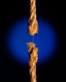
| 02/03/2004 06:09:19 PM |
Aquarius, The Water-Barerby adineComment: For some reason that water doesn't look like water. Il ike the nice blue lighting, and how it fades into black as it gets closer to the edges. |
| Photographer found comment helpful. |
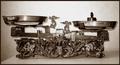
| 02/03/2004 06:06:30 PM |
libraby HeidieComment: The subject is interesting, but I think you could have tried a more interesting perspective to improve the photo, its just too ordinary right now. The lighting is a little harsh especially in the background which is blown out in the center. The two edges on the left, and the wall are a little distracting. |
| Photographer found comment helpful. |
Home -
Challenges -
Community -
League -
Photos -
Cameras -
Lenses -
Learn -
Help -
Terms of Use -
Privacy -
Top ^
DPChallenge, and website content and design, Copyright © 2001-2025 Challenging Technologies, LLC.
All digital photo copyrights belong to the photographers and may not be used without permission.
Current Server Time: 04/07/2025 10:09:45 PM EDT.