| Image |
Comment |
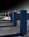
| 06/23/2004 05:28:47 PM |
Blue Postsby gajmajComment: Nice contrast and great focus. Composition leaves a little to be desired. Personally, I would've taken this shot 2 or 3 steps to the left to "seperate" the posts a little. I think this would work great as b&w but the blue feels out of place here. |
 Photographer found comment helpful. Photographer found comment helpful. |
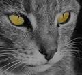
| 06/23/2004 05:26:08 PM |
'tinker'by suemackComment: Image is in excellent focus but lacks any white, other than a few speckles of the eyes. In other words, the image is too neutral lacking any highlights. The current image looks perfect when autoleveled and given maybe +10 on saturation in PS.
Nice attempt, but it feels as if it's a work in progress and not yet complete. Just autolevel and the image jumps right out at you! |
| Photographer found comment helpful. |
| 06/23/2004 05:16:46 PM |
Rainy Dayby SonifoComment: Strong contrast but image appears noisy and oversharpened (I'm sure it isn't rain). Even with all the sharpening, it seems the umbrella wasn't sharpened at all and seems soft. I would've done quite the opposite softening the background and sharpening the umbrella to further drive the point home. Even though the umbrella is in color, i'm drawn to the busy background and sharpness of everything else except the color of the umbrella. |
| Photographer found comment helpful. |
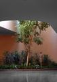
| 06/23/2004 05:13:20 PM |
Atrium #2by RasaiComment: Gray area at top a bit excessive. Also desaturation doesn't follow the line of the ceiling on the left side, seems a rather arbitrary cut off point. I'm sure a beautiful picture could've been produced here, just not photogenic at this angle or method of post processing. |
| Photographer found comment helpful. |
| 06/23/2004 04:57:19 PM |
Mr COOLby kevrobertsonComment: Appears to be an everyday snapshot. Good practice in selective desat, but uninteresting subject and composition. |
| Photographer found comment helpful. |
| 06/23/2004 04:55:16 PM |
|
| Photographer found comment helpful. |
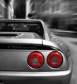
| 06/23/2004 04:51:18 PM |
Berlinettaby redmoonComment: Beautiful machine and excellent photo! Is she yours? I think desaturating the white of the reverse light made the tailights appear dull. Perhaps you could've left the yellow and white of the reverse and blinkers? |
| Photographer found comment helpful. |
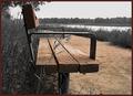
| 06/23/2004 04:47:19 PM |
A Selective Benchby ScantyNebulaComment: Appears if you selectively desaturated colors to achieve this effect. It would've been a pain to manually select the bits of dirt between the grass behind the bench. Nice idea, but I think with so much brown from the dirt on the right half, it draws attention away from the bench. |
| Photographer found comment helpful. |
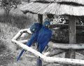
| 06/23/2004 04:44:24 PM |
Blue Birdsby Prime_TimeComment: Appears as if selective colors were desatured to supply this effect as there are still hints of color in the background (bluish tints) and the birds also look dull and have spots of gray. I'm sure the birds were more appealing in full color. Nice contrast but the perch near the bird's tails seem a bit blown out. |
| Photographer found comment helpful. |
| 06/23/2004 04:38:41 PM |
Graffitiby TooCoolComment: If graffiti is considered an art, would this violate one of the rules in depicting artwork of someone else? Or even if it were your own? |
| Photographer found comment helpful. |
Home -
Challenges -
Community -
League -
Photos -
Cameras -
Lenses -
Learn -
Help -
Terms of Use -
Privacy -
Top ^
DPChallenge, and website content and design, Copyright © 2001-2025 Challenging Technologies, LLC.
All digital photo copyrights belong to the photographers and may not be used without permission.
Current Server Time: 04/07/2025 10:11:43 PM EDT.