| Image |
Comment |
| 08/11/2006 01:38:36 AM |
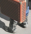
These boots aer made for walking....by SergePComment: Technically the elements are mostly there. Decent focus, could be a bit sharper, okay use of natural light - your whites aren't blown out but the light is flat. The composition is a bit iffy for me. I think there are too many busy things here. The boots seem to be the subject and I can see why the suitcase was added to give a bit more to the story but the design competes with the design on the shoes and the color looks brighter in comparison so its taking my attention away from your subject as named in the title. Overall it doesn't hold my interest. I gave a 4 |
 Photographer found comment helpful. Photographer found comment helpful. |
| 08/06/2006 05:32:35 PM |
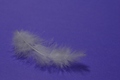
Floating in a Sea of Blueby karmatComment: I like the thought behind this image and I think it can definitely represent a zen feel. Unfortunately I think the lighting doesn't do the textures of the feather justice and instead give it a flat boring feel. Perhaps a single light source with a very directed beam of light highlighting from the side perpendicular to where the camera is pointing might work to bring out the feather details and add some depth and interest to the image? The focus is a bit off as well, it should be a bit sharper IMO so you still retain the softness of floating but are able to see the details the feather has to offer - the lighting is probably affecting this to some extent as well. I think the color choice for the background definitely works, helps promote a feeling of calm. There are some other technical issues with this photo but I think the biggest culprit here is the lighting. I gave a 4 |
| Photographer found comment helpful. |
| 08/06/2006 05:28:13 PM |
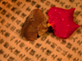
Samsara (a cycle of death and rebirth)by cislanderComment: I like the idea behind this image, and the balance it represents. Unfortunately I think it suffers a bit from technical issues. The focus on the dried portion looks okay, though more centered on the edge of the petal? when it really should encompass both petals as a whole since they are your main subject. the addition of the droplets is nice, helps further the idea of freshness and life but with the focus problems the drops actually accentuate the blurring. I like the character background but I'm not sure that it doesn't make the image too busy. I'm not sure if it would help, but if you can manage it, try puting the petals on a glass plate and place that about 6-8 inches above the character paper/background then fix your lights to ensure no distracting shadows and see if that helps separate your subject from its background, it *might* help contain the focus on the subjects where it belongs too. Just something I saw in my research but haven't tried yet, so I can't be 100% sure if it'd work out! I gave a 4 |
| Photographer found comment helpful. |
| 08/06/2006 05:23:46 PM |
Serenity Summitby ChrissysueComment: This is a nice landscape. I can see how it may be viewed as serene and thus it meets the challenge. I don't find much zen in it though on a personal level. I like the way the expanse folds out. Normally I'd find the ridge on the right distracting and wish I could see the view beyond it, but I find it is pointing my attention down to the valley and lake which is nice. The natural light is a little flat so the colors don't pop and really grab the attention, it feels as though a haze is over the image. I also wish the DOF was a bit deeper than it is, but obviously it can't go ALL the way into the valley. I'd also suggest a bit more of a crop along the bottom to get rid of the white in the corner. I'm not sure if boosting the saturation up a little would get those blues and greens to pop a bit more and possibly pull some of the pink out from the sky or not. Could be worth a shot? I gave a 4 |
| Photographer found comment helpful. |
| 08/06/2006 05:20:28 PM |
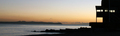
Early start at the Yacht clubby julesskiComment: Certainly meets the challenge. There's some nice color in the horizon and the silhouetting is good, I really like that aspect and how the more cubical form works with the organic forms of the rocks and sea. I wish the colors were a bit more vibrant, even though its a sunrise as they feel a bit on the flat side to me. The overall focus looks kind of soft, not sure if that's due to the low lighting or not. I gave a 4 |
| Photographer found comment helpful. |
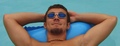
| 08/06/2006 05:15:22 PM |
Let The Day Go Byby JSAYBComment: This certainly has an aura of relaxation or sereneness to it but I don't find it meets my inner measure of zen. It does meet the challenge definition though. The focus seems a bit soft, perhaps because of the low light, which works here but I do wish it was a bit brighter so the skin would have more of a richness to it, he looks pretty well tanned so a nice glow (even for guys!) is nice. I like the colors and how they match but again with the low light they don't really pop. The image is nice but lacks a bit of pizzazz that I look for to give a top mark to. I gave a 5 |
| Photographer found comment helpful. |
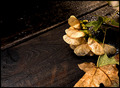
| 08/06/2006 12:29:24 PM |
Finishedby rjksteschComment: Excellent rich colors and fantastic details. I love how all the grains play against one another. This would make a great print in my estimation. I think there is zen to be found here, despite all of the areas of interest. I like the focus though I wish it were enough to get the entire leaf in the front as well just so the details of it were in play. I like the earthy colors and the water droplets definitely add something to the image. I would suggest cropping about a half inch off the top though, right about where the stem to those helicopter leaf things is. That leaves enough of a space above that it wouldn't look cramped, yet removes what I see as distracting that lighter portion where the bench ends. It also still keeps the screw visible which I think is a nice touch. I gave a 7 and added as a favorite. |
| Photographer found comment helpful. |
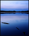
| 08/06/2006 12:25:23 PM |
Still Watersby SherwinJamesComment: Gorgeous color here. The still water and balance between it and the sky definitely speaks of zen to me as well. I like how the curves of the branch are similar to the curve of the shoreline though more perpendicular to it. There seems to be a bit of sharpening? distortions around the branch but maybe that's just compression goobers from uploading. I would suggest cropping out that last piece of stick at the bottom. I find it drawing me out of the image and I don't think its inclusion adds anything special to the photo. Very well done I gave a 7 |
| Photographer found comment helpful. |
| 08/06/2006 12:22:47 PM |
Japanese Teapotby flip89Comment: I love the simplicity of this. The organically shaped teapot contrasting with the linear scope of the blinds, the cool blue-gray contrasting with the brightly colored teapot and the low horizon line contrasting with all the verticals. Simply fabulous. I do wish there was a little light on the left side of the teapot but that's a minor thing. Very well composed and I find it meets both the challenge definition of zen and my own inner definition. Bumping from a 7 to a 8. |
| Photographer found comment helpful. |
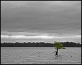
| 08/06/2006 12:20:33 PM |
After the Stormby adamwebComment: I like the juxtaposition of the selective color. The image has a great balance with the two birds on either side of the tree. There's a loneliness and calm to the image even though the water isn't completely smooth. The horizon line adds interest with the distant trees and the clouds seem to almost mimic the water. I think it looks a bit over sharp in some areas, particularly by the tree and I'd suggest cropping maybe a half inch off the top. Other than that I think its great. I gave a 7 |
| Photographer found comment helpful. |
Home -
Challenges -
Community -
League -
Photos -
Cameras -
Lenses -
Learn -
Help -
Terms of Use -
Privacy -
Top ^
DPChallenge, and website content and design, Copyright © 2001-2025 Challenging Technologies, LLC.
All digital photo copyrights belong to the photographers and may not be used without permission.
Current Server Time: 04/07/2025 10:18:12 PM EDT.