| Image |
Comment |
| 11/05/2005 03:40:47 PM |
IMG_1264.jpgby KevinRiggsComment: The R2D2 slippers worn by the person (girl?) on the right make this rather surreal photograph that much better.
|
 Photographer found comment helpful. Photographer found comment helpful. |
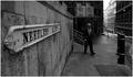
| 10/17/2005 02:19:01 AM |
Needless Alleyby mrmorrisComment: If the alley is superficial, that sign must feel pretty pointless hanging around announcing the fact.
The man in the background helps to anchor the scene, as well as adding a good reference for size. If this alley gets any traffic at night (or could have traffic placed on it at night) you could probably get an interesting shot of the passing car head/taillights illuminating the sign as they pass. |
| Photographer found comment helpful. |
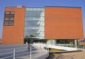
| 10/17/2005 02:14:53 AM |
ARoS // museum of artby visaksenComment: I find the full side of the building rather uninteresting. Perhaps if you'd moved in on some specific feature, such as the seam between the block of windows and the rest of the wall, it'd be a bit more interesting. As far as relevance to the topic: although this was probably taken at a wide angle, the perspective shift that causes the top of the building to look narrower than the bottom is the only real indication of this, and that's typically viewed as a flaw in architectural photography.
|
| Photographer found comment helpful. |
| 10/17/2005 02:08:26 AM |
As wide as I can go..by docpjvComment: I like the idea, but you held the shutter open for too long, and the scene looks overexposed in places. The thing that makes it look odd is the bright sky over the city lights. If you had added a burn layer or two to hold back the sky it would probably look alright. There also seems to be some distortion in the fine details (perhaps you moved the camera a little while the shutter was open). A good solid tripod is non-optional equipment for shots like this. |
| Photographer found comment helpful. |
| 10/17/2005 02:04:52 AM |
cori at 24by parrotheadComment: Wide angle lenses generally aren't very flattering for portraiture, and I'm afraid that this isn't an exception. I like the warm light, the pose and the DoF, but the wide angle distortion makes her head look oversized. Perhaps if you had shot this from near her feet to create that 'legs that go on for miles' look that high heels are designed to emphasize, the distortion could have worked in your favor.
Is she wrapped in cellophane? |
| Photographer found comment helpful. |
| 10/09/2005 12:04:24 AM |
rock starby parrotheadComment: Aren't shirts like this supposed to end before the bottom of the rib cage? Maybe I've just never seen such a shirt intact. The combination of the light and the shirt might be responsible, but the model's skin looks a little odd; it almost looks like you increased the saturation on the red or magenta channel to make the shirt contrast more with the coffee cup and it threw off her skin tone.
The crop makes this shot interesting. A little steam rising from the cup would have been nice, as would increasing the saturation of the cup a bit. This is one of the more memorable images in the challenge. Most of the impact is due to the subject and composition rather than the technical photographic execution; both of the former are good, but I can't help but think that something equally striking could have been done with the execution (shooting a similar crop of the girl reflected in a coffee cup perhaps). |
| Photographer found comment helpful. |
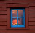
| 10/08/2005 11:59:02 PM |
The Back Roomby GermaineComment: I think that that thing in the left side of the bottom right pane might be a coffee pot, but even if it is the relation of this image to the challenge topic is quite a stretch. |
| Photographer found comment helpful. |
| 10/08/2005 11:53:38 PM |
Baseballby hstegComment: This is a good studio shot of a used baseball, but I can't imagine how this even remotely relates to the challenge. |
| Photographer found comment helpful. |
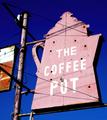
| 10/08/2005 11:50:13 PM |
the coffee potby arlanbartComment: The contrast between the sign and the deep blue sky is good, but frankly I find the color of the sky the most interesting part of this image. |
| Photographer found comment helpful. |
| 10/08/2005 11:49:01 PM |
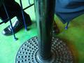
under the tableby ronragComment: I'll give you points for novelty, but aside from the geometry this isn't a particularly interesting shot. |
| Photographer found comment helpful. |
Home -
Challenges -
Community -
League -
Photos -
Cameras -
Lenses -
Learn -
Help -
Terms of Use -
Privacy -
Top ^
DPChallenge, and website content and design, Copyright © 2001-2025 Challenging Technologies, LLC.
All digital photo copyrights belong to the photographers and may not be used without permission.
Current Server Time: 04/08/2025 07:51:09 AM EDT.