| Image |
Comment |
| 11/06/2005 08:11:06 PM |
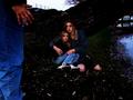
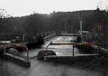
TRAPPED!by NeuferlandComment: The looks on the faces of the female models make this feel more like a high school play than a genuinely tense situation. Obscuring the model's faces may have let the strength of the situation shine through. The bright areas along the top and right edges of the frame lead my eyes away from the intended subject. Since this was an advanced editing challenge selectively darkening these areas would have been allowed, and probably would have improved the image.
|
 Photographer found comment helpful. Photographer found comment helpful. |
| 11/06/2005 08:05:14 PM |
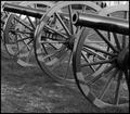
...of the cannonby mcrochipComment: The cannons behind the one in the foreground lead my eyes out of the image. Photographing this from in front of one of the cannons would have avoided this problem.
|
| Photographer found comment helpful. |
| 11/06/2005 08:03:06 PM |
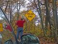
Dead End! Now What?by echo54Comment: This image implies a story, but while showing the person outside the car scratching their head does convey the intended idea, it seems like overacting. Taking the picture of the sign from the back seat with the man visible in the front seat with a crumpled up map on the dashboard would have felt more natural (well, as natural as an image of a guy consulting a map can look). I think that a more interesting story could be told if you'd have shot this from a lower angle and shown the front of the car on a jack with the person changing the tire, with airline tickets sticking out of his back pocket and the sign in the background.
|
| Photographer found comment helpful. |
| 11/06/2005 07:55:31 PM |
Time catching upby saintaugustComment: The light is rather flat; I think that harsher lighting and more contrast would have improved the image. |
| Photographer found comment helpful. |
| 11/06/2005 07:52:20 PM |
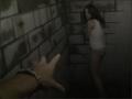
Dead-Endingby meowComment: The fuzzy vignetting is something typically reserved for pictures of weddings and puppies and smiling babies; using it here just seems bizarre. The busy pattern on the fabric behind the arm is distracting; a solid color located further behind the arm would have helped to direct attention to the intended subject.
The subject itself is somewhat ambiguous. Is this person taking some necessary drug (e.g. insulin), some illicit substance, or is this an intended suicide? Although such ambiguity could create dramatic tension and make the image more interesting, I don't think it works in your favor here.
|
| Photographer found comment helpful. |
| 11/06/2005 07:45:32 PM |
Out of Orderby grusComment: Selective desaturation can be a powerful compositional device, but this looks like a "because I can" use of the technique and detracts from the image. I think that partially desaturating the color on the rest of the image (rather than removing it entirely) would have directed the viewer's attention without making the technique itself the focus.
|
| Photographer found comment helpful. |
| 11/06/2005 07:35:38 PM |
FIRE!!by rayg544Comment: Without the title to clue me in it would have taken me awhile to figure out what this is. If you had stuck a candle wick or something in as the fuse and photographed this head-on with the DoF centered on the fuse this would have been a much stronger entry in this challenge.
|
| Photographer found comment helpful. |
| 11/06/2005 07:31:59 PM |
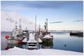
End of dockby gisliComment: The water is correctly exposed, but all of the snow and the sky is washed out. In this instance I think that you may have been better off underexposing the water. It might have been worthwhile to try coming back at night and shooting this as a long exposure; I suspect that the reflections could have been quite interesting.
|
| Photographer found comment helpful. |
| 11/06/2005 07:27:30 PM |
Now Where?by livitupComment: This is a novel shot, but I would have liked to see an angle which doesn't have the tree growing out of the sign. You'd need to check with the SC to be sure, but you may have been able to get away with cloning out the offending tree. The fall colors would have had a much stronger impact if you'd have increased the saturation a bit. |
| Photographer found comment helpful. |
| 11/06/2005 07:24:21 PM |
Country Laneby DianaComment: The picture is nice, but it doesn't seem to fit the challenge.
|
| Photographer found comment helpful. |
Home -
Challenges -
Community -
League -
Photos -
Cameras -
Lenses -
Learn -
Help -
Terms of Use -
Privacy -
Top ^
DPChallenge, and website content and design, Copyright © 2001-2025 Challenging Technologies, LLC.
All digital photo copyrights belong to the photographers and may not be used without permission.
Current Server Time: 04/08/2025 07:47:32 AM EDT.