| Image |
Comment |
| 03/26/2010 08:28:45 AM |
Money in the waterby hesperiaComment by Techo: You did a nice job with the lighting. Would only suggest a crop that takes off the empty side on the left. Would really put focus on the details and cool effects of the money dropping into the water. |
 Photographer found comment helpful. Photographer found comment helpful. |
| 03/25/2010 03:20:17 AM |
|
| Photographer found comment helpful. |
| 03/25/2010 01:27:37 AM |
Money in the waterby hesperiaComment by Abra: Not bad... and the coin on the right has some lovely smooth lines (must have been dropped from some hight or thrown pretty hard). If it was me I would have cropped tighter to show more details of the coins and removed the distracting glare from the left of the photo. |
| Photographer found comment helpful. |
| 03/24/2010 10:24:59 AM |
Money in the waterby hesperiaComment by FourPointX: clever idea pooor quality from the distracting background upper left to the dried water/shadows/bubbles visible below the money i still like it 6 |
| Photographer found comment helpful. |
| 02/07/2010 04:05:12 PM |
Theres somthing on my glassesby hesperiaComment by snaffles: Greetings from the Critique Club!
I think this is a very sweet photo. Glasses of course are quite fragile, as are bubbles, so a good combo of the two. The settings are fine for this shot.
However, dpc voters tend to dislike glare, and there really isn't much compostion. Image has a snapshot feel to it, which is why you have no comments (albeit a critique, now, and that you finished so low. Mind, you did get 3 10s.
I empathize because I can see what you wanted to do with this shot, and given the nature of the challenge that can be quite tough to do. My advice, as always: keep shooting. That really is the only way to improve. Second piece of advice: feel free to look at the early stuff I shot 3 years ago, when I first joined the site with a crappy little p&s. They'll not only make you feel better and hopefully encourage you to keep trying :-)
Feel free to PM me with any questions,
Susan
|
| Photographer found comment helpful. |
| 01/29/2010 07:19:04 AM |
|
| Photographer found comment helpful. |
| 01/27/2010 10:55:22 AM |
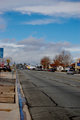
Main Streetby hesperiaComment by Luci11e: I think this shot have used a different angle or a different crop - its the street signs on the left that bother me. |
| Photographer found comment helpful. |
| 01/27/2010 09:53:51 AM |
Main Streetby hesperiaComment by Nuzzer: Too much sky puts the horizon in the centre of frame, more attention on the cracks in the road would be good |
| Photographer found comment helpful. |
| 10/16/2009 09:51:39 AM |
|
| Photographer found comment helpful. |
| 10/15/2009 04:49:35 PM |
|
| Photographer found comment helpful. |
Home -
Challenges -
Community -
League -
Photos -
Cameras -
Lenses -
Learn -
Help -
Terms of Use -
Privacy -
Top ^
DPChallenge, and website content and design, Copyright © 2001-2025 Challenging Technologies, LLC.
All digital photo copyrights belong to the photographers and may not be used without permission.
Current Server Time: 04/09/2025 07:18:00 PM EDT.