| Image |
Comment |
| 07/25/2003 08:49:16 AM |
|
 Photographer found comment helpful. Photographer found comment helpful. |
| 07/22/2003 05:28:45 AM |
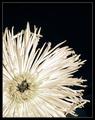
A Petal Apartby greenem2Comment by autool: I think your choice of a raggedy flower hurt you here. If it were symetric and true to form, then the viewer would migrate to the contrast element of the shot. I now get hung up on the un-aligned petals of the bloom. 6 |
| Photographer found comment helpful. |
| 07/22/2003 02:59:25 AM |
|
| Photographer found comment helpful. |
| 07/21/2003 06:08:19 AM |
A Petal Apartby greenem2Comment by timmi: This is my best pick of this challenge - I hope you win. Nice detail and great contrast. Stands out among others. |
| Photographer found comment helpful. |
| 07/21/2003 03:25:47 AM |
|
| Photographer found comment helpful. |
| 07/19/2003 04:25:06 PM |
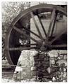
Water Worksby greenem2Comment by ScottK: I think more motion or less - this is just at an in between level where it just looks blurry. But the rest of the shot is definitely very sharp and crisp. I also think that just a little wider shot would have been a little better - it feels a little cramped as it is. But a very nice shot overall. |
| Photographer found comment helpful. |
| 07/16/2003 01:41:37 PM |
|
| Photographer found comment helpful. |
| 07/16/2003 09:14:05 AM |
Water Worksby greenem2Comment by Fayech: nicely composed photo. love the clarity and exclusion of color. the blurred wheel: I wish it was more blurred, or not blurred at all. hurts my eyes. :o) |
| Photographer found comment helpful. |
| 07/15/2003 12:57:25 PM |
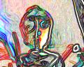
The Touristby greenem2Comment by Journey: This is very cool, greenem. Love it. Nice application of lines, lively colors. Also find this an excellent representation of Mr Tourist. If you have more digital art somewhere on a website, would love to visit it. |
| Photographer found comment helpful. |
| 07/13/2003 08:34:43 PM |
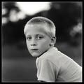
Baby Brotherby greenem2Comment by karmat: CRITIQUE CLUB CRITIQUE
by karmat
(Sorry I didn't get to this during the regular "critique" week, some things came up unexpectantly).
I simply love this and I suspect the parents/grandparents/guardians are looking forward to putting it on the wall. Though his head is centered, the body going out of the lower right really gives it a dynamic feeling and gives the eyes somewhere to go. The dof works well here to focus the attention on the boy, and not the background. I also like the bw, and I think the softness is okay, but do think it might be interesting if you have any with sharper focus.
I really can't think of anything I would recommend to make this better, as I think it is truly effective the way it is. Very nice work and best to you in future challenges.
karmat
|
| Photographer found comment helpful. |
Home -
Challenges -
Community -
League -
Photos -
Cameras -
Lenses -
Learn -
Help -
Terms of Use -
Privacy -
Top ^
DPChallenge, and website content and design, Copyright © 2001-2025 Challenging Technologies, LLC.
All digital photo copyrights belong to the photographers and may not be used without permission.
Current Server Time: 04/06/2025 09:04:55 PM EDT.