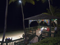
Alice doesn't live here anymoreby
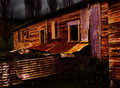
peppersprayComment by dahkota: Didn't forget, just got distracted... This is an interesting image. The hues are unexpected - purple and orange - and in some ways that enhances the image for me and in other ways it doesn't. But colorful typically does well on DPC. Now, lets get right down to it. Would I hang this picture on my wall? Honestly, no. For me, by my tastes, the image is too close - I feel claustrophobic looking at it. While there are many images that require being close, for me, this is not one of them. Or, the image needs to be closer to attach itself to some part of the structure. I really can't decide. But, in this challenge, I would go further away to give a better sense of space, of desolation.
My favorite part of this image is the textures. They are rendered so magnificently that I can see that may be what attracted you in the first place. Absolutely beautiful. My favorite is the corrugated metal in the bottom left - you could create an image just out of that. At least for me you could. The colors for me are at odds with the theme. Bright orange and purple are not colors that come to mind when thinking desolation. Blacks, greys, muted earthy colors all seem to work towards creating a mood. An image, a good image, is not just the replication of an object. There must be a story told by the use of lighting, color, POV, anything that gives us a sense of the object. Here, I am fascinated by your object but I don't get a sense of desolation. Desolation is much more apparent in your background - excellent moody tones BTW. I honestly can't tell you how to photograph this location to bring out its story. I have been working on a similar (though much larger) space and I'm just now getting a real sense of the place. But I could see a study completed here, if only a study of the textures. And the colors are great, I just don't think they lend themselves to the theme of desolation.
I have now rambled for a while. Hope it makes sense. I like your image but I feel it is waiting, for lack of a better word. What would be completely fascinating, to me, would be a study where you took shots of pieces of this place - the fence in one, the side in one, the window in one, etc. and put it all together allowing the viewer to see that it is pieces. Does that make sense? The building screams out to me that it is parts but not a whole. I think a treatment photographically would be amazing if similiar. This is not something I have tried - I have not found a place that would lend itself to that.
Technically I think you did a great job. Lighting good, DOF good, colors good. But, for the challenge of desolation I think it missed its mark due to the colors. Good luck in the challenge and let me know if I haven't explained myself correctly - I tend to do that when I ramble...