On Cloud Nineby
garrfosterComment by Falc: Meets the challenge - that is its square, but it has little or nothing else to help it along. Lets look a little deeper.
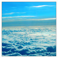
Horizon - if you are cropping to square then why didn't you crop to level the horizon. This tells me you have not really looked at your own entry too closely.
Clouds - Nice interesting shapes, tones are a little over cooked in those blue shadows. Need to use the levels or curves function in PS to ensure that you don't kill the detail in the shadow.
Blue Sky - Not a lot of interest here, its using too much space, the horizon could have been 2/3 or even more up the image. Solid blue is 'bland'.
Point of interest - where does the viewers eye enter the frame, what path does it follow?, where does it come to rest? There is nothing of comfort for the eye, its free to flit around the frame and is therefore 'uncomfortable'.
I recommend doing some reading on composition and layout, read about the thirds rule, about leading lines, about foreground and background.
Hope some of this might have helped.