| Image |
Comment |
| 11/13/2006 07:45:50 AM |
|
 Photographer found comment helpful. Photographer found comment helpful. |
| 11/09/2006 04:15:25 PM |
|
| Photographer found comment helpful. |
| 11/08/2006 01:36:19 PM |
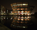
Library Building at Nightby bgrinbergComment by deepfrog17: awesome. just a little too dark. i would like to see the building all lit up instead of some dark areas. maybe a hair tighter of a shot left side with those signs and stuff. should do well. |
| Photographer found comment helpful. |
| 08/24/2006 08:20:42 AM |
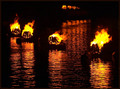
Battle of the Elementsby bgrinbergComment by atupdate: Hello from the Critique Club.
I didn't vote on this challenge so this is the first time I've looked at your image critically. My first impression of this image is "Wow, this has a lot of stuff going on". To the voter, this means that there isn't one true focal point to the image to lock in on visually except for the color. And in this challenge, the color is pretty common. There are a couple of areas within this image that are competing with each other and neither one wins. First, there are the two fire pots on the left. The spacing difference between these two pots and the two on the right make it difficult to choose which group is more important. Second, the pots at the top of the image almost look like they were partially cropped off (Most probably something is blocking the view). Actually cropping the top fire pots might have helped the image but leaving their reflections in the water would have looked odd. When all is said and done, you probably should have simplified the composition by zooming in on just one of the groups.
On the technical side, I agree with the one commenter that you need to use as much of the 150 kb file size as possible. It can only help the quality of your images. Second, it looks like you might have overexposed this image or oversaturated during post processing, as the flames have a strange look to them (blown highlights and flat looking yellow areas).
Feel free to PM me if you have any questions regarding this critique.
Tim
|
| Photographer found comment helpful. |
| 08/18/2006 08:42:08 PM |
Battle of the Elementsby bgrinbergComment by klstover: Lovely. Absolutely lovely. Maybe I would prefer it cropped tighter on top to remove the smaller figures? To me, they do not fit so much in the overall composition. Still though, I like the photo, and the smaller figures do not really detract from the shot too much.
One thing to keep in mind for future is to keep your file size to as close to 150KB as possible to increase image quality. |
| Photographer found comment helpful. |
| 08/17/2006 05:33:49 PM |
|
| Photographer found comment helpful. |
| 08/15/2006 08:28:22 AM |
|
| Photographer found comment helpful. |
| 08/15/2006 05:43:31 AM |
Battle of the Elementsby bgrinbergComment by posthumous: I like the mysterious nature of the shot, i.e. its lack of context, and the composition is interesting. The coloring strikes me as a little dull but that might just be because I'm seeing so much of it in this challenge. 7 |
| Photographer found comment helpful. |
| 08/15/2006 03:47:55 AM |
|
| Photographer found comment helpful. |
| 08/14/2006 05:38:22 PM |
|
| Photographer found comment helpful. |
Home -
Challenges -
Community -
League -
Photos -
Cameras -
Lenses -
Learn -
Help -
Terms of Use -
Privacy -
Top ^
DPChallenge, and website content and design, Copyright © 2001-2025 Challenging Technologies, LLC.
All digital photo copyrights belong to the photographers and may not be used without permission.
Current Server Time: 04/11/2025 05:51:06 AM EDT.