| Image |
Comment |
| 11/21/2005 06:11:20 PM |
|
 Photographer found comment helpful. Photographer found comment helpful. |
| 11/21/2005 04:41:43 AM |
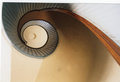
Spiral.jpgby WatermelonSugarComment by alfresco: Very cool photo. Excellent leading line and placement of the spiral core. The color doesn't have much impact for me, I wonder how it would look in b/w. Anyway, very nice photo! |
| Photographer found comment helpful. |
| 11/21/2005 04:27:51 AM |
|
| Photographer found comment helpful. |
| 11/21/2005 04:27:08 AM |
|
| Photographer found comment helpful. |
| 11/21/2005 04:26:33 AM |
|
| Photographer found comment helpful. |
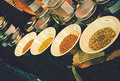
| 11/21/2005 04:11:47 AM |
Spices.jpgby WatermelonSugarComment by Germaine: Good subject matter. The perspective makes me feel as if everything is about to fall off the table, but that's me. Also, a lot of "noise" in the dark areas. If that's what you wanted, fine, but do you have access to Neat Image or some program like that? |
| Photographer found comment helpful. |
| 11/21/2005 03:41:35 AM |
|
| Photographer found comment helpful. |
| 11/20/2005 09:37:54 PM |
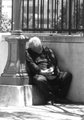
Sleepby WatermelonSugarComment by suemack: Nice work. I really like where you are going with this shot.
I think I might have framed it a bit differently though, horizontal not vertical and cropped in closer to the post he's sitting on so you couldn't see the landscape behind him. This would show more of the concrete on the right, less of the bars above. He'd have been nestling in the corner, not the centre of the shot, and just then added a bit more (-)brightness/(+)contrast.
Looking forward to seeing more of your work.
sue |
| Photographer found comment helpful. |
Home -
Challenges -
Community -
League -
Photos -
Cameras -
Lenses -
Learn -
Help -
Terms of Use -
Privacy -
Top ^
DPChallenge, and website content and design, Copyright © 2001-2025 Challenging Technologies, LLC.
All digital photo copyrights belong to the photographers and may not be used without permission.
Current Server Time: 04/11/2025 08:29:07 PM EDT.