| Image |
Comment |
| 05/07/2007 12:33:14 PM |
|
 Photographer found comment helpful. Photographer found comment helpful. |
| 05/06/2007 10:40:36 AM |
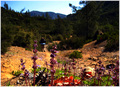
Into the great wide openby kmbr2001Comment by Tez: Nice DOF... but i think the oversaturation lets it down as it results in some distortion at the back. I think overall its a little too saturated and I would have liked to see more of the flowers in the foreground as at the moment I find them distracting me from looking at the back. which is where the areas of interest seem to be. |
| Photographer found comment helpful. |
| 05/03/2007 03:43:14 PM |
Into the great wide openby kmbr2001Comment by yanko: Compositionally I'm not sure you're showing the great wide open very well. The tress/hill/mountain all sag within the frame towards an off centered spot and the weeds lead towards the center. So what you got is a scene that feels almost claustrophobic which is the exact opposite of what your title says. The vivid colors also don't help as it only makes the scene more complicated. The key here is simplicity. Having less shapes makes it easier to achieve harmony within the composition. The more you add the harder it is to maintain it and I think that's what happened here. This is not a bad photo so just take this as some feedback. Good luck. |
| Photographer found comment helpful. |
| 05/02/2007 10:30:55 PM |
Into the great wide openby kmbr2001Comment by stphw: the focus here is on the flowers and not the great wide open. Its like the guy has left his kid behind who doesn't want to go on the walk. :-) |
| Photographer found comment helpful. |
| 05/01/2007 01:26:00 PM |
|
| Photographer found comment helpful. |
| 05/01/2007 08:10:19 AM |
Into the great wide openby kmbr2001Comment by Haneck: Nice vivid colors! The lighting looks a little harsh though - almost like it's either backlit or maybe in the middle of the day. Nice shot though! |
| Photographer found comment helpful. |
| 04/26/2007 05:12:45 AM |
|
| Photographer found comment helpful. |
| 04/24/2007 09:21:04 PM |
|
| Photographer found comment helpful. |
| 08/14/2006 05:02:48 AM |
|
| Photographer found comment helpful. |
| 08/11/2006 12:39:05 PM |
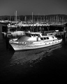
of luxuryby kmbr2001Comment by LucidLotus: I love it. Black & white with deep contrasts. Wonderful. I like the pattern of masts and the negative space at the bottom. I think shaving a smidge off of the bottom (maybe half an inch) would still keep the open feeling yet compress the image just slightly. You've kept the natural light under control here and it really works to the image's advantage since its making the contrasts so apparent. Very nicely captured. I gave a 7 |
| Photographer found comment helpful. |
Home -
Challenges -
Community -
League -
Photos -
Cameras -
Lenses -
Learn -
Help -
Terms of Use -
Privacy -
Top ^
DPChallenge, and website content and design, Copyright © 2001-2025 Challenging Technologies, LLC.
All digital photo copyrights belong to the photographers and may not be used without permission.
Current Server Time: 04/06/2025 10:21:14 PM EDT.