| Image |
Comment |
| 06/11/2007 02:34:18 AM |
|
 Photographer found comment helpful. Photographer found comment helpful. |
| 06/10/2007 07:54:19 AM |
|
| Photographer found comment helpful. |
| 06/09/2007 09:46:41 AM |
|
| Photographer found comment helpful. |
| 06/09/2007 07:16:52 AM |
|
| Photographer found comment helpful. |
| 06/08/2007 05:30:39 PM |
|
| Photographer found comment helpful. |
| 06/08/2007 02:35:28 PM |
|
| Photographer found comment helpful. |
| 06/06/2007 05:53:36 PM |
|
| Photographer found comment helpful. |
| 05/13/2007 06:14:27 PM |
Shapeby TimmyQComment by karmat: CRITIQUE CLUB CRITIQUE
by karmat
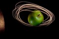
Admittedly, I love minimalistic photography, but this shot absolutely rocks. It's simplicity speaks volumes, I believe. It meets the challenge well, as it is symmetrical, and it balances space and 'occupied space' well too.
I honestly cannot come up with anything to make this a better shot, unless it would be to use another color for the light, just to grab the viewer's attention. Obviously, most of the commenters liked it as well, pulling from five years of dpc experience, I suspect most of the low voters are people who do not like minimalistic shots, people who like for the story to be told within the photograph (whereas your shot tells the story by what is NOT in the photograph), or think that shots like this are simple to achieve. It's not that they are wrong or bad or shouldn't be voting, that is just some of the voter mentality that is out there.
6.2 for your first challenge is not bad AT ALL, and you have a shot you can definitely be proud of. I look forward to seeing your future entries, and will be looking for one of your shots on the front page, soon.
Karma |
| Photographer found comment helpful. |
| 05/12/2007 12:38:49 AM |
Shapeby TimmyQComment by kano: Like this image a great deal, its simplicity is what makes its so appealing, & great lighting ...add to faves :) |
| Photographer found comment helpful. |
| 05/09/2007 01:39:30 PM |
Shapeby TimmyQComment by Techo: So very elegant. Really like the lighting. As a study I like it as is. As for the simplicity it works.
If I was to wonder how to spruce things up, not that it's needed. If two small glasses layed to rest and create a v shape with stems, or something similar, would've added just a bit more to the composition. |
| Photographer found comment helpful. |
Home -
Challenges -
Community -
League -
Photos -
Cameras -
Lenses -
Learn -
Help -
Terms of Use -
Privacy -
Top ^
DPChallenge, and website content and design, Copyright © 2001-2025 Challenging Technologies, LLC.
All digital photo copyrights belong to the photographers and may not be used without permission.
Current Server Time: 04/09/2025 12:01:57 PM EDT.