| Image |
Comment |
| 01/07/2005 04:33:18 AM |
|
 Photographer found comment helpful. Photographer found comment helpful. |
| 01/02/2005 04:30:45 PM |
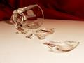
It Bytesby sannokComment by Olyuzi: Appears overexposed and the format and subject matter seem to clash. With the subject weren't truncated on bottom. |
| Photographer found comment helpful. |
| 01/02/2005 09:37:05 AM |
Drinking is Badby sannokComment by steinar: If drinking is affecting your life in a negative way... yes. I would have liked the focus to be on the first piece of glass and the camera positioned lower. A bit to much of yellow color. Good setup. |
| Photographer found comment helpful. |
| 01/01/2005 09:39:20 PM |
Drinking is Badby sannokComment by Bran-O-Rama: Appears as if middleground is in focus. Would've been nice to have a slightly larger DOF, then focusing on the large chunk of glass on the right. Blurry foreground objects hurt the eyes. |
| Photographer found comment helpful. |
| 01/01/2005 02:59:41 PM |
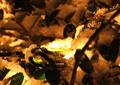
Warmth of First Snowby sannokComment by swagman: sannok
I like the warmth created by the color shift. The patterns created by the branches and leaves also add interesting detail to the overall piece.
WHere this fails, imo, is the lack of a define subject - or main point of interest, if you will. The point near the light is obviously intended as such, and that's where the eye is initially drawn because of the high contrast there, but I can't define what the object is (the shape doesn't stand out sufficiently}, so we have a background with a highlight, but no discernable subject. Lacking that, it's kind of neat, but fails overall.
Just my opinion, of course. |
| Photographer found comment helpful. |
| 12/30/2004 03:08:42 AM |
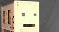
It Bytesby sannokComment by admart01: you made the most of this one! title helps, lighting points out the hidden face, backdrop eliminates distraction. not necessarily the most interesting item (some sort of computer gadget?) |
| Photographer found comment helpful. |
| 12/29/2004 04:54:05 PM |
|
| Photographer found comment helpful. |
| 12/29/2004 07:53:40 AM |
It Bytesby sannokComment by scrum8: Lightinh is a bit harsh, and the missing side panel is a distraction. Ilike the texture and color of the background. |
| Photographer found comment helpful. |
| 12/29/2004 05:48:56 AM |
It Bytesby sannokComment by notonline: Is this a photo that you would actually hang on a wall??? or on a wall in plane view for people to see??? In my opinion this photo lacks interest. |
| Photographer found comment helpful. |
| 12/26/2004 03:36:18 AM |
|
| Photographer found comment helpful. |
Home -
Challenges -
Community -
League -
Photos -
Cameras -
Lenses -
Learn -
Help -
Terms of Use -
Privacy -
Top ^
DPChallenge, and website content and design, Copyright © 2001-2025 Challenging Technologies, LLC.
All digital photo copyrights belong to the photographers and may not be used without permission.
Current Server Time: 04/09/2025 12:01:45 PM EDT.