| Image |
Comment |
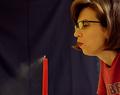
| 12/17/2004 10:05:52 PM |
Exhaleby brockmdComment by Prof_Fate: The backdrop is wrinkly. her glasses are reflecting something too bright - remove the glasses to remove a distracting element. Your white balance seeems off - or she has jaundice. The writing on the shirt is also a distraction - basic compositional rule: unless it adds to the picture's meaning/intent, then it should not be there. The red shirt goes with the red candle, but the words? Perhaps a closer crop, lower the modle's head a bit OR have her turn to face the camera at about a 45 degree angle... |
 Photographer found comment helpful. Photographer found comment helpful. |
| 12/17/2004 05:43:16 PM |
Exhaleby brockmdComment by sailracer_98: I think this is a great idea. I have a few suggestions on how I think this photo might be improved. First, I would make the background darker and/or blur it with a shallow DOF. Second, the white balance looks like it wasn't set correctly rendering the smoke, the skin and everything else yellow. I'm guessing this was shot with tungsten lighting but the camera's white balance setting was not changed to match. Third, the writing on the shirt is distracting and should probably be cropped out. I think some or all of these changes would result in a very striking photo. |
| Photographer found comment helpful. |
| 12/16/2004 06:05:22 PM |
|
| Photographer found comment helpful. |
| 12/16/2004 09:21:19 AM |
Exhaleby brockmdComment by Dseale: It would have been neat if the background was black, and the model was wearing black..so everything blended in. |
| Photographer found comment helpful. |
| 12/03/2004 07:08:28 PM |
Reflectionsby brockmdComment by HBunch: Doh! I see the start of the 8th one. Seeing that one, lets me know that there weren't really just 7 of these, that you cheated and cropped it just to make it look like there were 7 of them...but oh well...you got it anyway. lol. I think the thing about this shot that bugs me a little is the lighting. seems dark. when I think of roses, I think of bright, glowing flowers. play with the brightness/contrast and maybe up the saturation a bit. I think that could make this really punch. Fucs on the flower seems a slight bit soft. I like the repetition. ~Heather~ |
| Photographer found comment helpful. |
| 12/03/2004 03:41:35 PM |
|
| Photographer found comment helpful. |
| 12/03/2004 07:53:17 AM |
Reflectionsby brockmdComment by sabphoto: creative, great color and cropping but having a hard time finding a sharp in focus one. This could be due to uploading compression so no points off. |
| Photographer found comment helpful. |
| 12/02/2004 11:28:58 AM |
Reflectionsby brockmdComment by drydoc: And the cost of this presentation was. . . ? Neat idea. Focus, depth of field, needs to be a little more even front to back. BOL |
| Photographer found comment helpful. |
| 12/02/2004 10:35:42 AM |
|
| Photographer found comment helpful. |
| 12/02/2004 07:19:48 AM |
Reflectionsby brockmdComment by grainman9: Reflection device has been used alot lately. This arrangement is nice. The folds on bottom right help fill the space and the colours are relaxing. You have me the challenge with style. I would have put a border on it to contain the elements but judging by comments that I get, I woould be deducted for that. |
| Photographer found comment helpful. |