| Image |
Comment |
| 06/18/2007 05:58:32 PM |
|
 Photographer found comment helpful. Photographer found comment helpful. |
| 06/18/2007 06:04:23 AM |
|
| Photographer found comment helpful. |
| 06/14/2007 07:41:18 PM |
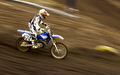
Pure Powerby hjolliComment by stphw: I love how you've captured the action here. I can really imagine the power of the bike. There's a bit of a yellow cast over the photo - esp parts of the bike and some hot whites in the guys gear. The shade of brown is really pleasing to look at. |
| Photographer found comment helpful. |
| 11/07/2006 02:08:28 AM |
|
| Photographer found comment helpful. |
| 11/06/2006 09:38:50 PM |
|
| Photographer found comment helpful. |
| 11/06/2006 03:21:28 PM |
Self portraitby hjolliComment by sniper: Sense Appeal-6
Layout-7
Creativity-8
Applied Techniques-5
Meets the Challenge-9
Average-7 |
| Photographer found comment helpful. |
| 11/03/2006 02:19:22 PM |
Self portraitby hjolliComment by Blackbox: I guess a sihlouette is kind of a portrait. It's got the feeling that it's cold outside. Good luck to ya! |
| Photographer found comment helpful. |
| 11/01/2006 07:34:36 AM |
Self portraitby hjolliComment by jaysonmc: Not sure if I would consider this a portrait since you can't see any of the face. It is a nice silloutte though, and the colors and nice. |
| Photographer found comment helpful. |
| 07/05/2005 09:24:49 AM |
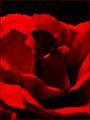
This one is for youby hjolliComment by saracat: While this is a beautifully and artfully moody shot, I do have a couple of problems with it. The brighter of the reds look oversaturated. IMO, the border is unnecessary (though I did not take off for it) - the way the photo is cropped is enough (for me at least) to define itself; the frame is 'extra' and really isn't needed. (Like I said, it's a beautiful shot.) The biggest problem I have with it, though, is that in scoring a macro/close-up photo, I place a heavy emphasis on clarity of texture and detail. IMO, a macro should show detail that may not be obvious to the naked eye or to the casual observer. I like the shot, and in a different challenge (where I would not place so much emphasis on sharp focus), I would have scored this a 7 or 8. For this challenge, because of the oversaturated red and the lack of clarity, I am scoring this a 5. |
| Photographer found comment helpful. |
| 07/04/2005 02:55:04 PM |
|
| Photographer found comment helpful. |