| Image |
Comment |
| 01/15/2003 06:59:02 PM |
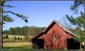
Farmscapeby KrazyKatComment by dodobird: Great shot, I don't really consider this a classic landscape, but the shot is great. The barn draws the most attention and I don't pay any attention to the rest of the landscape. Good placement of the trees relative to the barn, overall great shot.7. |
 Photographer found comment helpful. Photographer found comment helpful. |
| 01/15/2003 06:34:17 PM |
Farmscapeby KrazyKatComment by karmat: Good placement of the objects (trees, barn, etc) in the frame. Also, I like how the green trees and red barn contrast. I think there needs to be just a touch more space in the foreground if possible. It kinda feels like the barn is sitting on the bottom of the frame, and it seems off balanced to me. |
| Photographer found comment helpful. |
| 01/15/2003 02:11:51 AM |
Farmscapeby KrazyKatComment by goodtempo: great composition and color. i like the tree on the left but it's cut off a little too much or not enough. the trunk of the tree causes a bit of an imbalance in the image. |
| Photographer found comment helpful. |
| 01/14/2003 02:36:42 PM |
Farmscapeby KrazyKatComment by bod: Nice shot, the barn adds colour to the scene but doesn't overpower the image. Lovely blue sky & great light *envy*, well done. |
| Photographer found comment helpful. |
| 01/14/2003 02:38:54 AM |
Farmscapeby KrazyKatComment by paynekj: Nice job of illustrating the barn in the landscape. My only comment is that the crop of the tree on the left seems a little too far in. I think I would have put the edge of the picture so that it didn't cut into the tree-trunk. |
| Photographer found comment helpful. |
| 01/13/2003 08:00:56 PM |
Farmscapeby KrazyKatComment by indigo997: Love the colors and the lines of the barn. I feel like it is cropped too closely though. The barn is almost sitting on the bottom of the frame. Back off some and include the more of the tree on the left and more of the grass in the foreground. Nice lighting. |
| Photographer found comment helpful. |
| 01/13/2003 02:01:06 PM |
|
| Photographer found comment helpful. |
| 09/14/2002 08:30:00 AM |
Granny Smithsby KrazyKatComment by Gracious: good color and contrast. Background helps this image to pop. The focus is a little soft. OVer all good! Good luck in the callenge. Gracious aka Grayce |
| Photographer found comment helpful. |
| 09/13/2002 11:43:00 AM |
Granny Smithsby KrazyKatComment by karmat: Good detail and i like the shadows on the apples. The only minor (very minor) nit is that you can see the texture of your background. Without that, it would look like the apples were suspended. karmat |
| Photographer found comment helpful. |
| 09/12/2002 01:40:00 AM |
Granny Smithsby KrazyKatComment by jsabbarton: This is a good shot. But, I can see a tiny flaw with the composition. The main subject is perhaps a little to central in my opinion. I think that off-setting the fruit, to the right and down in this case, would weaken the strength of the slightly overpowering background and boost the central subject. This is only my opinion. I love the way the apples blend into the darkness on the left edge, but there is a slight glare on the apple skin. Try bouncing or diffusing the light source in some wayâ€Â¦ That said, it might sound like I don't like the shot – on the contrary, I think it's a great shot (8) |
| Photographer found comment helpful. |
Home -
Challenges -
Community -
League -
Photos -
Cameras -
Lenses -
Learn -
Help -
Terms of Use -
Privacy -
Top ^
DPChallenge, and website content and design, Copyright © 2001-2025 Challenging Technologies, LLC.
All digital photo copyrights belong to the photographers and may not be used without permission.
Current Server Time: 04/06/2025 09:04:51 PM EDT.