| Image |
Comment |
| 07/24/2003 03:29:13 PM |
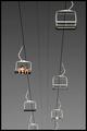
shortcutby spidermanComment by robsmith: A contrast not many had thought of, good work. It almost appears to be black and white until you se the splashes of colour. Slightly noisy sky (sharpening?) and if you'd have taken the shot slightly later the positioning of the seats would have been more pleasing to me (no accounting for my taste though!) |
 Photographer found comment helpful. Photographer found comment helpful. |
| 07/22/2003 06:27:05 PM |
|
| Photographer found comment helpful. |
| 07/21/2003 07:23:48 PM |
shortcutby spidermanComment by wetland: Very neat...really neat. Only critique would be my preference to have the backdrop lighting more even across the image rather than darker at the top. Thanks |
| Photographer found comment helpful. |
| 07/21/2003 07:02:49 PM |
shortcutby spidermanComment by ChrisW123: Excellent idea. Great job waiting for just those 2 people in the shot. Nice crop, keeping the cart in the upper right corner. |
| Photographer found comment helpful. |
| 07/21/2003 04:18:29 PM |
shortcutby spidermanComment by Alpine99: I love the clean graphic nature of this shot.. the framing is excellent and the contracst between the sky and the people is great.. I hope this is a winner! |
| Photographer found comment helpful. |
| 07/21/2003 03:08:36 PM |
shortcutby spidermanComment by ellamay: The two things that 'get' me about this shot is the emptiness in it, I think it is great, and I love the black and white tones in contrast to the color people. The lines too are clear, simple and add to the perspective. All around really nice. very nice. |
| Photographer found comment helpful. |
| 02/21/2003 01:06:11 PM |
Late Afternoon Birdieby spidermanComment by zadore: ...from Critique Club...
Hi John :)
FIRST IMPRESSION:
Real cool shot...love it :)
COMPOSITION:
Very nice, IMO. The only thing that bugs me is the shawdow on the bottom. I think that if you had moved to the right a bit, and shot at a lower angle you could have made that shadow less predominant...but then again, you are the one who really knows what the environment was like :)
TECHNICAL:
Lighting if very nice, exposed right, IMO. Focus could be a bit sharper (even post-processing)..nice job :)
ARTISTIC:
Real cool idea. I think you nailed the challenge right on the head with this one. :)
Cheers and good luck in the future challenges. |
| Photographer found comment helpful. |
| 02/20/2003 11:51:06 AM |
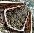
On The Right Trackby spidermanComment by Gracious: Greetings from the Critique Club
The subject is a good one, and popular with many. It's sort of timeless, with little change over the years. So at the same time it is current and nostalgic.
The depth of field seems to work just fine, although I'd like to see the whole a little sharper.
All the wood within the tracks is wonderfully textural and adds much dimension to the image.
I like the crop but, personally, not the angle. I understand it is a matter of personal taste though, and others really like it.
Overall a decent image that could be presented in several different ways.
Regards,
Grayce |
| Photographer found comment helpful. |
| 02/16/2003 06:55:47 AM |
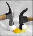
Delicate Extractionby spidermanComment by BAMartin: Critique Club Critique
(1) COMPOSITION (CONTENT) Your composition is strong. Both of the hammer heads lie along the rule of thirds lines. The handles of the hammers lead the eye to the eggs, and consequently the yolk which is the subject of the photograph. Someone commented that the yolk being in the exact middle ties the two sides of the picture together and I have to agree with that. This adds to the strenth of the photo.
(2) BACKGROUND The background is a little distracting to me. The wrinkles and creases in the plastic bag do not add to the overall composiion of the photograph. I am wondering if you could have used some darker plastic instead of the white.... now sure how that would have looked but it might have been worth a try.
(3) CAMERA WORK ,TECHNICAL The focus is wonderful, everything is very sharp. Lighting is very even and the small amounts of shadow are very light and not distracting at all.
(4) DIGITAL PROCESSING ,TECHNICAL Your post processing is good. Saturation is good. The colors just pop here and there is certainly that "wow" factor. Your cropping is excellent. I do not see any way that you could have improved on this.
(5)MEETING THE CHALLENGE This does an excellent job of meeting the challenge.
(6) MY OPINION ON THE PHOTO The subject here is great. The way you executed it is great. This is a photograph that you should be proud of. |
| Photographer found comment helpful. |
| 02/02/2003 08:04:43 AM |
|
| Photographer found comment helpful. |
Home -
Challenges -
Community -
League -
Photos -
Cameras -
Lenses -
Learn -
Help -
Terms of Use -
Privacy -
Top ^
DPChallenge, and website content and design, Copyright © 2001-2025 Challenging Technologies, LLC.
All digital photo copyrights belong to the photographers and may not be used without permission.
Current Server Time: 04/07/2025 12:00:55 AM EDT.