| Image |
Comment |
| 03/12/2006 01:06:57 AM |
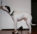
Okay for PB Ill do itby loudzgamerComment by ShutterPug: this just isnt getting for me. sorry - but the image looks like snap shot and is very flat. Lacks creativity. If you want to incorporate peanut butter on a spoon, with high heels and your sweet doggie - try thinking of ways to present it in an appealing manner. Have it tell a story. |
 Photographer found comment helpful. Photographer found comment helpful. |
| 02/28/2005 03:28:03 AM |
|
| Photographer found comment helpful. |
| 02/28/2005 01:10:23 AM |
|
| Photographer found comment helpful. |
| 02/27/2005 10:21:21 PM |
|
| Photographer found comment helpful. |
| 02/27/2005 08:17:47 PM |
|
| Photographer found comment helpful. |
| 02/27/2005 08:00:52 PM |
|
| Photographer found comment helpful. |
| 02/21/2005 05:26:24 PM |
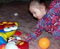
My Toys Mu Toysby loudzgamerComment by rblanton: To me this seems a nice picture for a family album and would hold a cherished spot there. However here in a photographic challenge the family album type picture is up for public viewing and by posting it there invites public praise, indifference or apathy. The flash detracts from the picture and gives the face unnatural colors, harsh ones that belie the soft skin of a child. It appears that someone pulling the child out of the fram which feels a bit artificial, if you intended to show force depriving the child of her toys then I feel it should have been a bit bolder show of that force. I like the thought of a child separated from its treasure trove without seeing ruination and despair in the child. Perhaps the idea needs a bit more polishing but it does hold to the theme. Hope this was not too harsh, just meant for it to be constructive. |
| Photographer found comment helpful. |
| 08/16/2004 06:45:58 AM |
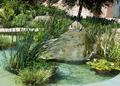
Angels Gardenby loudzgamerComment by emorgan49: aack - tilted horison - straighten it and your score wiil improve - it is unsettling to the viewer to be on a slant/ |
| Photographer found comment helpful. |
| 08/16/2004 06:26:55 AM |
Angels Gardenby loudzgamerComment by willem: the building in the background, the pavement in front, both could have been avoided and as such make the image better. One step closer, a lower viewpoint, concentrating on the water, rock and plants would have done it. |
| Photographer found comment helpful. |
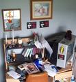
| 04/09/2004 07:34:41 AM |
Organized Chaosby loudzgamerComment by Dave Gordon: The desk meets the challenge. I think the pictures on the wall detract from the effect; could have been cropped in to include just the desk and shelf. |
| Photographer found comment helpful. |
Home -
Challenges -
Community -
League -
Photos -
Cameras -
Lenses -
Learn -
Help -
Terms of Use -
Privacy -
Top ^
DPChallenge, and website content and design, Copyright © 2001-2025 Challenging Technologies, LLC.
All digital photo copyrights belong to the photographers and may not be used without permission.
Current Server Time: 04/10/2025 11:50:39 PM EDT.