| Image |
Comment |
| 09/27/2004 06:09:49 PM |
flower 2by danrmComment by hlswilson: I had to go back to your photo three or four times before I could really get a handle on what I thought. I agree with arpita on the fact that it looks a little busy. The point where I get that busy feeling is when my eye looks at the focal flower. My eye moves down from there where I see two more blooms, then back up where I see at least two more. I would have like to have seen those uppermost two blooms removed and replaced with more green. IMHO, the single petal of the in-focus bloom at the top of the frame should also be removed. It looks a little lost. The out of focus bloom next to it is brilliant. I wish there were more of them. It's a nice way to repeat the color without taking attention away from your focal point. The other thing I enjoy about this is the dimensional contrast that you create. The lower 1/3 is practically one dimensional with the cream vase on a white background. The upper 2/3rds then is vibrant color and clearly multi-dimensional. I found it a bit jarring at first, but then quite beautiful once my eyes settled into it. Did you plan this, or was it a pleasant suprise when you looked at it on the computer? Definately keep some white space between flower stems, however, as it helps to balance out the upper and lower portions.
Whoa! I talk too much. :-) Anyhoo... I hope this was helpful. Very nice work. Print it! |
 Photographer found comment helpful. Photographer found comment helpful. |
| 09/27/2004 02:17:57 PM |
flower 2by danrmComment by Kylie: The colors and the diagonal thrust are my favorite aspects of this shot. The negative space gives it a great fell and movement. I agree with Arpita that I would leave a little less space at the botton or add one other element into the picture. Just beautiful!! |
| Photographer found comment helpful. |
| 09/27/2004 02:15:21 PM |
flower 1by danrmComment by Kylie: What a wonderful, striking composition! The uplift of the petals and the bold, saturated colors are great. Perfect arrangement within the frame, and I like the subtle tapering off of the color as the stem recedes. Great work! |
| Photographer found comment helpful. |
| 09/27/2004 01:48:01 PM |
|
| Photographer found comment helpful. |
| 09/27/2004 01:46:19 PM |
flower 2by danrmComment by arpita: I like the colors, and this overexposed kind of look, it has a very clean feel about it. Composition wise, I find the picture a little busy, maybe fewer stems would make it easier to focus on one subject flower. Also, the empty bottom of the picture is a little unsettling.. you could try using a vase with some color, or moving up (or zooming in) and getting less vase.
|
| Photographer found comment helpful. |
| 08/07/2004 01:57:25 AM |
sue and seaby danrmComment by sfalice: Personal preference of course, but if it was mine, I'd probably include more of that door or none of it... Other than that, quite nice composition. |
| Photographer found comment helpful. |
| 08/07/2004 01:54:37 AM |
|
| Photographer found comment helpful. |
| 11/10/2003 07:56:56 PM |
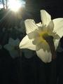
morning sunby danrmComment by TooCool: Nice job of capturing the background flowers in the darkness. I also like the back lighting on the main subject flower.
TC |
| Photographer found comment helpful. |
| 11/10/2003 10:07:23 AM |
|
| Photographer found comment helpful. |
| 11/09/2003 02:01:55 PM |
|
| Photographer found comment helpful. |
Home -
Challenges -
Community -
League -
Photos -
Cameras -
Lenses -
Learn -
Help -
Terms of Use -
Privacy -
Top ^
DPChallenge, and website content and design, Copyright © 2001-2025 Challenging Technologies, LLC.
All digital photo copyrights belong to the photographers and may not be used without permission.
Current Server Time: 04/09/2025 11:58:17 AM EDT.