| Image |
Comment |
| 12/02/2015 06:34:24 AM |
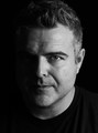
Monsieur mystèreby StickInMindComment by Lydia: Greetings from the Critique Club!
Ha! I JUST commented on this... then went to see if there were any images waiting in the CC queue. They're randomly assigned and this popped up for me. Ha!
I do love the lighting... it's perfect, in my opinion. Absolutely ADORE the focus right there on your eye. Perfect, too.
The BW conversion is... well... perfect too. I also appreciate the way you didn't smooth your skin as some folks do. So masculine that way.
I don't know why this isn't at least in the Top Ten. Or why there were no comments during voting.
The only nit pick I can even come up with is that it seems overly sharp in some places... like the top of the hair and I'd have cloned out the white glinting whiskers. But, that's only because I'm searching hard to find something wrong. *grin*
|
 Photographer found comment helpful. Photographer found comment helpful. |
| 12/02/2015 06:26:19 AM |
Monsieur mystèreby StickInMindComment by Lydia: No comments on this excellent image?
I thought I had commented during voting.
I love the low key... and the excellent lighting and focus... right where it should be.
|
| Photographer found comment helpful. |
| 11/25/2015 03:14:55 AM |
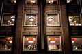
The indonesian restaurantby StickInMindComment by sidpixel: Hello from the Critique club
An interesting image that meets the challenge
Well done for spotting the potential from this scene to create something quite unique. The red lampshades are very distinctive in this near mono sepia image, I also like their contrasting square shapes against he round ones above. Your symmetry is pretty near spot on and well justified for the image here. The one criticism I am tempted to make is the vertical cropping, I wish we could see more of the upper windows and lamps, this could have been done with a little sacrifice of the bottom of the frame which I feel is less important than the top of the frame. I am not keen on these 'artistic' PS filters but I can fully understand why you have chosen to use them in this challenge.
Thanks for your original entry |
| Photographer found comment helpful. |
| 11/18/2015 06:39:42 PM |
|
| Photographer found comment helpful. |
| 11/18/2015 06:02:48 PM |
|
| Photographer found comment helpful. |
| 11/18/2015 06:24:12 AM |
|
| Photographer found comment helpful. |
| 11/07/2013 04:21:42 AM |
Pastel - Darker than whites and lighter than lightby StickInMindComment by jjstager2: I really like the composition, crop choice and pose. Interesting blue tones on the black hair complimenting the magenta BG. If I wanted to be picky, I'd suggest matching the color of the lipstick more closely to the BG color. I would also suggest the light on her face is just a bit too bright. Great work on this one. |
| Photographer found comment helpful. |
| 11/03/2013 11:50:32 AM |
|
| Photographer found comment helpful. |
| 07/06/2011 12:48:53 PM |
|
| Photographer found comment helpful. |
| 07/01/2011 12:45:24 PM |
Sairaby StickInMindComment by Jutilda: What a sweet little angel. The skin seems a touch orange - maybe an adjustment?? |
| Photographer found comment helpful. |
Home -
Challenges -
Community -
League -
Photos -
Cameras -
Lenses -
Learn -
Help -
Terms of Use -
Privacy -
Top ^
DPChallenge, and website content and design, Copyright © 2001-2025 Challenging Technologies, LLC.
All digital photo copyrights belong to the photographers and may not be used without permission.
Current Server Time: 04/11/2025 05:50:41 AM EDT.