| Image |
Comment |
| 07/24/2009 02:55:28 PM |
Street Photography In Color! by howie733Comment by macrothing:  Critique Club Critique
First Impressions
Critique Club Critique
First Impressions
Certainly quite a 'gay' image. There's a street sign, it's very colorful, your title reinforces the Challenge - I guess you made it over the line. However, there's not much interest in it for me to hold my attention.
Photograph Information, Technicals & Composition Review
I see you've selected the Humor gallery for this and I imagine many folk find this an amusing image, however it doesn't have that appeal for me. Composition wise, especially for this Challenge, it seems too 'squashed' into the frame. More street, more pose, more context would likely have allowed other elements to come into play more and create more interest and story. The image also looks like it may benefit from straightening.
Comments, Score & Placement Review
59/135 is pretty good for this Challenge and the score of 5.28 seems about average. Your commenters all seem to like it and enjoy the frivolity of the image.
Summary
Cropped this close the colors clash a little in my opinion and I can't help but imagine a richer scene out of the frame. It's a moment captured, but the character looks like he has more of a story than this crop is allowing to be told. |
 Photographer found comment helpful. Photographer found comment helpful. |
| 07/21/2009 07:29:49 PM |
|
| Photographer found comment helpful. |
| 07/20/2009 02:45:09 PM |
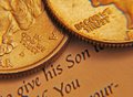
In God We Trustby howie733Comment by Ecce_Signum: Greetings from the Critique Club Howard.
First off I like your idea, the composition is very good and O personally like the fact there are 3 elements to the image. I'm slightly confused by the depth of field looking at your exif data but quite like the fact that the sharpest part of the image is the message you were trying to convey. Chromatic aberration was mentioned in your comments and think this is an exposure issue? You don't show your editing steps but it looks to me as if you overused the shadow/highlight function in CS3 (or similar).
Was the paper white? I quite like the fact the paper colour merges with the coins here. I didn't vote in this challenge but would probably have skipped past it with a 5 as (for me) it doesn't grab my attention.
Good luck with your future challenges here at dpc. |
| Photographer found comment helpful. |
| 07/20/2009 03:36:39 AM |
|
| Photographer found comment helpful. |
| 07/19/2009 06:31:21 AM |
|
| Photographer found comment helpful. |
| 07/15/2009 10:06:58 AM |
|
| Photographer found comment helpful. |
| 07/15/2009 03:01:05 AM |
|
| Photographer found comment helpful. |
| 07/13/2009 06:05:33 PM |
|
| Photographer found comment helpful. |
| 07/08/2009 02:00:52 PM |
|
| Photographer found comment helpful. |
| 07/07/2009 08:11:50 PM |
|
| Photographer found comment helpful. |
Home -
Challenges -
Community -
League -
Photos -
Cameras -
Lenses -
Learn -
Help -
Terms of Use -
Privacy -
Top ^
DPChallenge, and website content and design, Copyright © 2001-2025 Challenging Technologies, LLC.
All digital photo copyrights belong to the photographers and may not be used without permission.
Current Server Time: 04/09/2025 11:12:53 PM EDT.